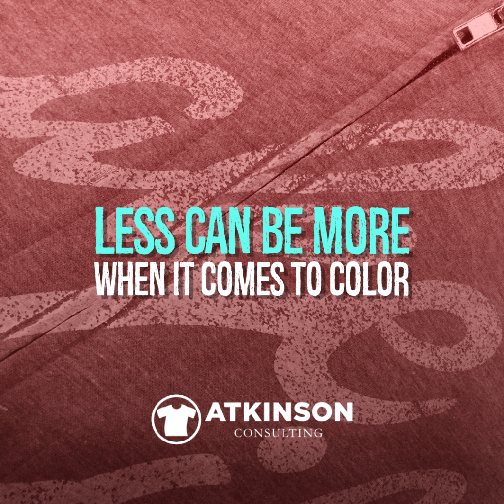
Less can be more when it comes to color sometimes.
Think about the number of colors your shop offers for printing. Artists typically always want to use more, because hey…that’s what is going to make the design better. Right?
While that certainly can be true, it also adds some complexity to the job that might not be needed.
More color can equal a higher price. Is the job out for bid? Instead of five colors, can you do it in three?
More color can also add to production time. For example, how many more jobs a day could your crew print if there were fewer screens to set up?
You don’t have to sacrifice great design either. There are plenty of tricks you can do that will provide impact and punch to the design. Let’s take a look at a few:
Less Color / Thinned Ink
This has to be one of my favorite tricks in my design bag. I love using Curable Reducer.
While there are plenty of folks that are constantly talking about the need for opacity, let’s champion a completely opposite mindset.
Translucency.
This simply means we can see what’s underneath the ink. This can be another printed color, a pattern on the shirt, or a texture of the shirt. To me, this is far more interesting sometimes than an opaque ink color. It looks more natural and authentic.
It also prints with a softer hand, which is the rage currently.
Distressed Graphics
An always popular design look is vintage and distressed. Nothing works better for this than reducing the ink and letting something underneath show through. 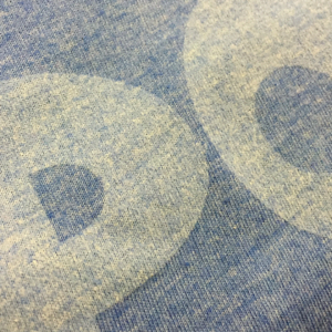
For example, let’s say you are printing on a Heather Blue t-shirt with White ink. If you reduce that White ink down, it has an almost chalkboard like feel to it on the Heather Blue shirt. Pair that up with a hand-drawn design or font, and you have an instant classic.
What’s great about Curable Reducer is the more you add to the ink, the more translucent the ink becomes. As the name suggests, it cures like it is a regular ink. A lot of shops call this “Thinned” ink.
It looks faded and old. Worn.
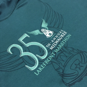
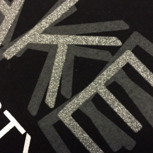
Another popular choice for me is what I call “Smoke” ink. I’ve written about this before.
Instead of using White ink on that shirt, try using Smoke. This will shadow that shirt color to a darker shade. On a shirt that is Red, it will look Maroon. For Royal Blue, it will look Navy. Similar to the White ink formula with Curable Reducer, the more additive you stir in, the more translucent the mixture becomes.
Smoke ink is the absolute best drop shadow you will ever use.
Reduced ink like this is the perfect solution for printing over that hoodie seam or pocket. Couple that with a distressed texture, and it’s a winner.
Overprinting
Another popular choice for designers is to overprint one color on another to produce a third color. When you use thinned inks this makes it easy.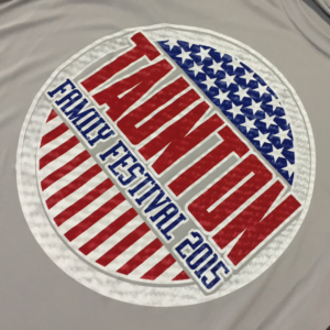
On press, print the lighter color first. You can either flash it or leave it wet. Flashing of course locks in that color as a base and will prevent the following ink from mixing in that color. But sometimes that’s what you want.
For example, take a peek at this design I made a few years ago. The Smoke plate is used to overprint the Red, Blue, and White plates to produce darker areas in each for the texture I wanted.
On Red, this shows up as Maroon. On Blue, it’s Navy, and on White, it appears Gray.
This print only used one White, and the screen with the Smoke ink was printed last without flashing.
Engineering your art this way produces more color on the shirt, but takes less time to set up and print. It also reduces your color count, and makes your quote to your customer cheaper so maybe you will win that order!
Another Less-Ink Tip / Traditional Halftones
Halftones have been around for a very long time. While nobody can be attributed to the invention of halftone photomechanical process, William Henry Fox Talbot patented the first use of them for textiles in 1852.
In your shop, using halftones can be a great way to add more dimension to your design without adding any extra production cost. 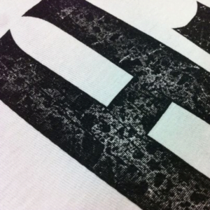
So let’s say you are working on a design and want to add another color to separate the primary element from a secondary one. Sure, you can use another color for that secondary idea…but what if you used a halftone instead? My question to you is this.
“Do you really need that second color?”
It’s a good question to ask. A lot of shops have their production color count hijacked by their art department. The creative minds want that extra ink color because it’s a color quality thing to them. This usually starts when customer service or sales give up that control with the question, “Hey, how many colors is this?”
Suddenly that image that you thought was three or four colors is now six. Or eight.
Of course, there are eight colors in that design. But if we use some halftones in a few we can get the color count down to a manageable (and sometimes affordable to the customer) level.
Printing halftones though can be tricky for some shops. There are entire books and video series dedicated to this subject. If you want to be the best at this, I would recommend Mark Coudray’s Halftone Mastery Course.
Color Hierarchy
In your design, the colors you choose can have a dramatic impact on the overall design. Bolder colors are naturally going to come forward, weaker colors will recede. It’s how our eyes see things.
Sometimes though, I’ve seen designs with color balance completely out of whack. And, it’s not the intentional someone breaking the rules because they are creative kind.
You don’t need a lot of colors if you play your cards wisely and throw in a halftone or two for some screens.
DuoTones, TriTones, & QuadTones
Yep. 2, 3, and 4 color jobs. The basis for about 75-80% of the work in the t-shirt screenprinting industry. But, when that shop gets that 10 or 12 color press suddenly the color counts go dramatically skyward.
With some good Photoshop manipulation, you can make that complicated design simpler color-wise and pare it down to only a few plates. It might even lend itself to some funky expression.
Instead of printing that photo in 8 or 10 colors, what if you used two? One was purple and the other orange? Pink and royal blue? Ok, throw in a black plate too, just for the contrast.
The point here is that you can make that image work with fewer plates…and be creative at the same time.
Specialty Inks
Want more drama? There is an entire line of inks out there that can certainly help you punch things up.
Adding texture or dimension to your inks is a time-honored tradition in this industry. When was the last time you thought about using some?
 Throw in some puff additive in that color that is for your outline around the text. Printing a design with something in the image that would be made of glass or water or chrome? Use a hit of gloss clear.
Let’s not forget the awesomeness of using metallic inks.
Liquid silver or gold on a black shirt. ‘Nuff said.
A lot of shops, especially beginners, tend to not think about these as design choices when discussing and planning the job with their customers.
It’s like they haven’t learned the vocabulary yet.
Do yourself a favor and order some specialty inks, bases, or additives from your ink supplier. Get a sample kit or two. Play around with them and learn how to use them.
More importantly, learn when to use them.
Specialty inks could be just the ticket for that next job.
“Never pick a fight with people who buy ink by the barrel.” – Mark Twain
“Space is the breadth of art.” – Frank Lloyd Wright
“The details are not the details. They make the design.” – Charles Eames
Ever thought about Shop Coaching?
I’ve been in the decorated apparel industry since 1993. I started out as an art director and did that for 14 years. Then I moved to operations and running shops.
Throughout the years, I’ve traveled and been to many shops, and have worked with companies of all sizes.
Some folks just need a mentor to help them through the rough spots or simply someone to talk to as an advisor. Others are a hot mess and if they can’t get their act together they will keep losing money and go out of business.
Not sure where you are on that spectrum, but I’d love to chat with you about your shop. I have an inexpensive Intro Plan that starts at $99 a month.
If you are tired of pulling your hair out and losing sleep at night because you don’t know what to do, give me a call and let’s see if I can help.
[av_button label=’$99 / Month Intro Plan’ link=’manually,https://atkinsontshirt.com/product/99-per-month-intro-plan/’ link_target=’_blank’ size=’x-large’ position=’left’ label_display=” icon_select=’no’ icon=’ue800′ font=’entypo-fontello’ color=’theme-color’ custom_bg=’#444444′ custom_font=’#ffffff’ av_uid=’av-lzdr9g’ admin_preview_bg=”]