Recently I reposted an excellent blog article by Rick Roth from Ink Kitchen on my social media feeds. (Please read Rick’s article!) My repost of that article on LinkedIn prompted an interesting online discussion and a few phone calls.
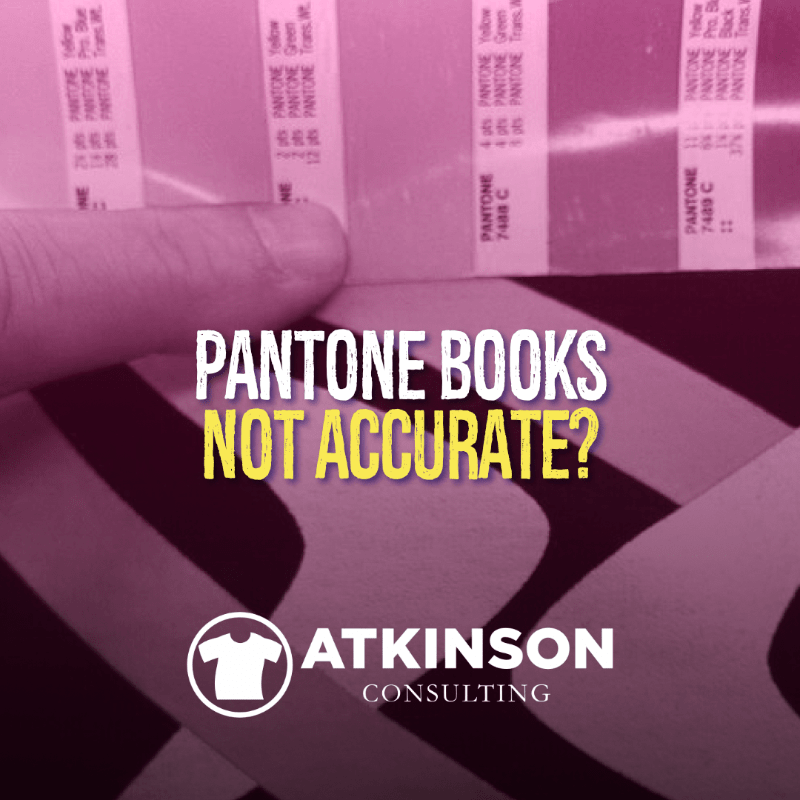
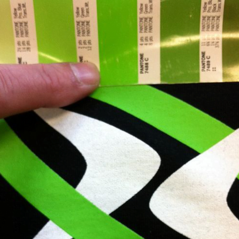
The crux of the matter? Brand new Pantone books were compared to one another and some of the color swatches didn’t match.
You can see the dilemma from a mile away.
If Pantone, the de facto color guide expert, can’t get its own product printed with matching sets of color, how in the hell is the rest of the print world supposed to do that as well?
How many orders have you had rejected because the client said the color on the order was “off”. For you, it matched perfectly in the shop. You even took a picture.
Ut oh. Something stinky is afoot.
Pantone’s Disclaimer
Here’s something from the Pantone website that addresses this very issue.
“None of the printed formulas are known to be inaccurate in previous guides and our Master standard digital data has not changed since inception. However, it is possible that a few select colors in some guides visually appeared differently due to wider process variation based on variables in the printing process such as paper stock, base pigments, finished inks, press conditions, and environmental conditions – all of which can contribute to inconsistency.
The printed formulas for each Pantone color are intended as guides and are subject to adjustment in order to accommodate specific print conditions. Leveraging advanced X-Rite software and hardware technology, the updated guides reflect better-standardized color appearance across various print runs. We recommend Pantone Paper Chips of your desired color always accompany artwork and design files as the precise color intent to strive for on press. We also recommend evaluating all color-critical decisions against Pantone master digital data, which is accessible through PantoneLIVE or other Pantone-licensed solutions, in order to ensure better color accuracy in your daily work.
There are several factors that can affect the appearance of the colors in guides and books. Colors can appear inaccurate over time as a result of handling, fading, improper storage, and light exposure, among other factors. Additionally, there are many normal printing industry variables that, even with extremely small changes, can contribute to color appearance changes from print run to print run, such as: paper composition and absorption, inks (pigment source, viscosity, and drying conditions), print variation due to ink metering, production speed, and environmental factors. These can lead to changes in lightness, hue, and chroma. In particular, small changes in hue can have noticeable visual differences due to our innate human sensitivity to hue changes.”
Some Thoughts Here
First, “none of the printed formulas are known to be inaccurate”. Just because you don’t know there is a problem doesn’t mean it doesn’t exist. You simply aren’t aware of it. Yet.
Secondly, “However, it is possible that a few select colors in some guides visually appeared differently due to wider process variation based on variables in the printing process such as paper stock, base pigments, finished inks, press conditions, and environmental conditions – all of which can contribute to inconsistency.” So if there are variables that contribute to any inconsistency when printing the books…why aren’t they eliminating the variables that lead to these problems?
That’s what we do.
It sure sounds a lot like that they know about the problems, they just don’t have a solution but are happy to sell you their product anyway. And, don’t you just love the “if you really want your printed image to match, be sure to include a printed Pantone chip with your project so it will match.” Sell more stuff! What if the chip and book don’t match each other, let alone the ink formula?
So, if you look up a Pantone Book on Amazon it’s $116.97. In the description, there is a blurb that says “PANTONE Colors are internationally recognized for color communication and are globally available. You can specify PANTONE Colors with confidence even if your manufacturing is half a world away.”
Sure you can specify a color. Confidence? Hmmm.
The Problem Compounded
Plenty of printers mix their inks based on formulas provided by the various ink companies in the industry. I’m sure that you may have completed that task a few times in your shop yourself.
The idea is that using the information provided by Pantone, the ink companies can specify by weight exactly how much base and pigments to use to create the desired Pantone color match for exactly how many grams of ink you want to mix. If you aren’t mixing the ink yourself, these companies will also sell you premixed ink too.
So what’s the first thing you do after you mix up that container of ink? Check it against a PMS book for accuracy.
Does it match?
Yes? Great. Get that job running! But what if it doesn’t match the Pantone book that the customer brand manager is sure to wield when the shirts arrive? You won’t know until the angry phone call.
No? Ut oh. You must have done something wrong when you mixed it. That’s when you grab a new container and remix another batch. Yikes! It’s the same color as the first mix. So now is it the ink mixing formula that is wrong or your Pantone book? It’s a head-scratcher.
The foundation of our color world is now extremely shaky. I’ve always been lead to believe that Pantone was infallible. After all, they are the experts, right?
Now the emperor has no clothes. Or at the very least clothes are being worn, but nobody can tell specifically what color they are.
An Ink Company Executive Says:
I spoke to an ink company executive about this and asked their opinion on the matter. Due to commercial circumstances, they have asked me to withhold naming them, but here’s what they have to say:
“We are amazed by their statement of “Colors visually and digitally aligned to the 2010 Pantone Master Standards.” Does this mean that the subsequent books (2012, 2014, and 2016) had a color-shift or were inaccurate? Also if the 2019 book was rematched to the 2010 master standards then what are the 756 new colors matched to? Also, Pantone states that the “…aiming at a CIEDE2000 of 2.0 or less…” We as manufacturers have to meet a tolerance of 1.0 or less and using their X-Rite equipment. It seems like a double standard.”
Want to learn what the CIEDE2000 means? Check out this paper “The CIEDE2000 Color-Difference Formula: Implementation Notes, Supplementary Test Data, and Mathematical Observations” by Gaurav Sharma, Wencheng Wu, and Edul Dalal from the University of Rochester. The CIEDE2000 formula provides an improved procedure for the computation of industrial color differences. It’s the math behind the visual differences in color. It’s about three miles over my head, but check it out anyway.
This guides how close a color can be to actually “match”. Standards are a good thing. But they have to be used.
In Real Life
I’m sure if you have been in business long enough in this industry you have had issues with a customer and your shop over a Pantone color match. I’ve actually obtained clients because “my last guy couldn’t hit our brand color consistently”.
One problem that we all suffer is how people look at and gauge color. How is the lighting in the room? What color is the substrate? Are they looking at the color compared to a swatch book, or something that is printed in their office like a business card? I’ve even had clients compared the printed shirt to the image on their phone or computer and claim it doesn’t match.
There are multiple source points for misery here.
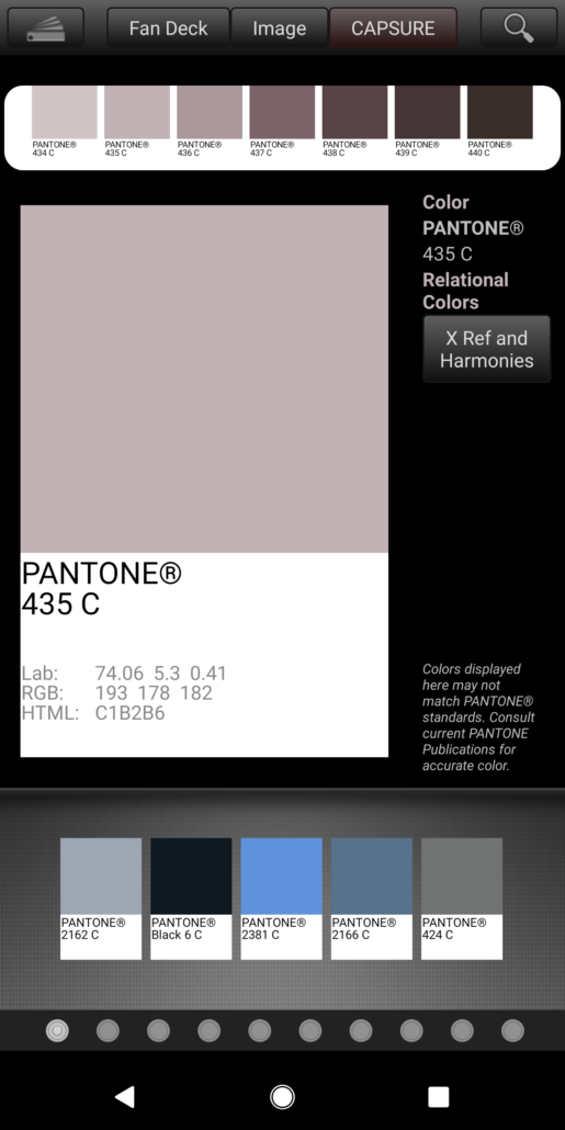
In Rick’s Ink Kitchen article I mentioned in the first paragraph, the problem was that the gray was pink looking, and not gray. Do yourself a favor, whip out your PMS book and look up PMS 435.
Is it pinkish or gray in yours?
Just to throw a monkey wrench into the works, I have the Pantone app on my phone and here’s that gray as shown on the app with a screenshot. It looks pink to me. Even with the knowledge that the phone’s screen has a color cast you can tell that this is a pinkish-gray.
Does this mean that for PMS 435 if yours looks battleship gray, then it is wrong? Imagine if this was your client’s corporate color?
Your Opinion
So, to end this article, I’m curious about your stories and tales of horror when dealing with Pantone matching issues. Not so much from the “we can’t hit the color” perspective which is an entirely different discussion…but more of the “we did it right and it was still wrong” sort of problem.
What’s your take on this? Leave a comment below.
Double brownie points if you work in an ink company or better yet, Pantone.
“A brand’s color becomes its calling card, creating associations and expectations, triggering mental images and memories. Studies show that the right color can increase brand recognition by up to 87%.” – Pantone
“Working with more than one supplier can mean variations in processes and equipment, leading to results that can vary significantly. Our cloud-based color tools can ensure that your suppliers are all aiming toward the same target, for consistent results across the board.” – Pantone
“Your color may be consistent throughout a production run, but will it match the run before it? Or the one that follows? Color measurement and evaluation tools from Pantone and our parent company, X-Rite, make it possible to achieve consistent color from run to run, no matter when or where it is produced.” – Pantone

5 comments
Eddy Hagen - insights4print
It’s a known issue, especially with printers, but nobody wants to talk about it and Pantone’s marketing is so good that it makes designers, brand owners believe that there system is a guarantee to a 100% exact color reproduction. However: their own tolerances are 2 dE00 for about 90% of the colors, for 10% it’s more. But who knows which colors are outside that 2dE00? I don’t. (see: https://www.insights4print.ceo/2021/07/how-to-pick-and-define-that-valuable-brand-color-a-fundamental-issue/)
I’ve written a number of articles on it, including a test of 19 printers that measured 4 different patches in their Pantone Color Guide, with their spectrophotometer. Here are the results: https://www.insights4print.ceo/2018/11/your-color-guide-and-you-first-results/
BTW: that claim of increasing brand recognition, that’s taken out of context. The original studies that showed an increase of brand recognition was on the use of color versus black and white, not on a color reproduction within a certain tolerance. More about that: https://www.insights4print.ceo/2019/02/color-increases-brand-recognition-by-80-the-real-contents-of-the-loyola-study-revealed/
And for those who want to take a deep dive into reproduction of brand colors, I’ve just made a video presentation for the TAGA 2021 conference: “Brand color tolerance: A reality check”: https://www.taga.org/2021-presentations/ Please note that this is all focused on commercial printing and packaging, I can imagine that color reproductin on textile has even more challenges (e.g. the fabric, the fibres might influence color perception).
DSQman
Just received a Pantone Color Bridge Guide Coated GG6103A *Color Reference Guide* and comparing to our other guide, the hues and vibrancy seem off for sure. The whole guide feels cheaper and less quality printing. We are likely returning it. Not sure what we will do if you can’t relay on PANTONE being the same very time. You pay a whole lot for that confidence which is now gone.
Samuel Gutierrez
https://uploads.disquscdn.com/images/0d91c9b5203c244be055dac3b6437fe7aa4270dabac2cfa8520a490d93764bbe.jpg Wow, thank you sir for taking the time to put together this article! I’m kind of blown away by this discovery. Months back I designed a piece of underwear packaging for the company I work for. We used the boxes’ base color as a way to differentiate between different fabrics we offer. We consulted our Pantone swatch book to choose a light grey…PANTONE 435! The same box needed to be produced at separate printers in China as we were producing the goods in multiple factories. One factory’s printer nailed the grey, the other had a decidedly more pink grey. We did a long back and forth to try to figure out how they could be so off. They swore it matched their Pantone, and I sent them photos to show them it certainly did not. I guessed maybe they had an old book, where the inks had maybe faded, I even considered maybe my book, which I bought new through eBay, was maybe a counterfeit. Our solve was to just send him a cut piece from the grey box, from the factory we decided printed the matching color, and have them match to that as a swatch.
Later I bought the Pantone chip book, directly from Pantone, and the 435 chip does not match the 435 in the fan book! I just Googled PMS 435, and coincidentally came across your article. We now make it a point to go the extra step and send a PMS chip for specification.
Maxie Garb
There is a lot that can be said about correct color. We normally try and get as close to the color in the Pantone coated guide. This works well with customers who worked with designers who also use the guide and know what the color actually looks like. Often we get graphics from designers who work only on screen. What they see is not what we see. The screen is RGB, unless it is a fairly expensive graphics quality screen that has been calibrated the color will not be accurate. Look at a few uncalibrated screens, the color will be different on each one.
Now we get to printing, print on a white or dark shirt, chances are the colors won’t be identical. Get a bit of bleeding on 50/50 and you are now way out.
I always tell my customers that Pantone is a system designed for paper, we can be close but not 100%.
Marshall Atkinson
Thanks Maxie for sharing! What’s curious here is that now I’m going to be distrustful of the printed swatch books, as Pantone has proved that they can’t even print them to match. It throws the whole thing off. It’s good that you are getting expectations and education out of the way early. Good job.