A client’s graphic designer was in the office the other day wanting to know the latest tips and tricks for inks that they could use to present to their sales team. My response was a good natured joke, “Hey, how about a one color black left chest on a white shirt. It’s all the rage!” I was just kidding, but everything doesn’t have to be a ten color simulated process job, or use some funky specialty ink to be “different”… Ludwig Mies van der Rohe was right – less is more.
You know the drill. We’ll print anything they pay us for. Most designers want to constantly cram exceedingly more colors onto their t-shirts, as if that will make their designs better somehow. If we installed a fifty color press, the next day a designer would want to print a forty-eight color shirt. Sometimes though, simpler can be better. It’s probably harder to actually use fewer colors, so think of it as a unique challenge. Especially when you combine print location, ink color, design and print skills into the mix… Check these out below and think about how you could incorporate them into your oeuvre.
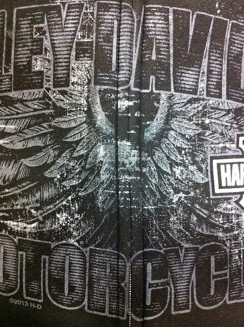
Vintage – Printing on any heather color shirt in any location, you can channel your inner design time-machine and print a translucent white, gray or other color. Always looks great on garment dyed too. Base down your ink color with curable reducer until it has the transparency you are happy with and print through a higher mesh screen. Even with regular plastisol, there will be virtually zero hand on the shirt. A based down white looks fantastic. This is how that chalkboard effect is achieved. This should be the core staple of t-shirt designers everywhere that get handed the angst ridden sales team request at 3:45 in the afternoon, “come up with four great designs by tomorrow that will sell, I need them for a sales presentation”. Insert the “Property of” design here. Click.
Combine this faded glory look with a striking print position such as in the corner of a hoodie pocket, upper shoulder of a long sleeve, inside the box created by the stitching of a sewn neck label, down on the lower left hem, or maybe even at the end of a long sleeve cuff. Throw in a designed distressed texture for good measure.
Spinal Tap – With this technique, “the numbers all go to eleven”… Take a word or phrase with a good character count and print it right down the middle of the back. It’s going to look like a stripe, but that’s the intent. As the viewer is always used to seeing things right side up and centered for visibility, turning it 90 degrees and having it travel down the spine is a bold move. Really set it off by choosing a high contrast ink color, or maybe even some reflective ink. Whatever you choose, it will look great and stand out from the crowd, as people aren’t used to seeing this on a shirt. Double ironical points if you choose yellow. Unless you are scared.
Shoulder Seam – Print on a sport-shirt next to the shoulder seam on the upper left chest or upper left back. The trick is to get as close to the seam as possible. Just use your sleeve platen, and load the shirt so the seam hangs off. Print away. Printing this as a one color means you are adding more value to the simple print, as this is a difficult print position to pull off. This looks great for sports or adventure brands, as it’s not the norm. Try it on sportshirts, warm-ups or jackets.
Side Print – Does everything have to be a full front or full back? What if the print was on the side of the t-shirt? This super trendy look is easy to accomplish on-press, as you just load the shirt sideways, with the sleeve centered and hanging off the top of the platen. Some t-shirts may have a seam, so check for that and take that into consideration when designing. Printing over the seam is easy, but you have to take care or the ink will puddle up near the seam sometimes and look misprinted. Base down your ink slightly, use higher mesh with good tension, and watch your squeegee pressure. Distressed textures in the design can camouflage any problems printing the seam too.
Bottom Hem – I’m seeing more of this location lately, and for good reason, it looks great. There used to be an unwritten rule that all images on the front of the shirt had to be up around the chest as people would tuck in their shirts in their pants. That rule died I don’t know how many years ago, as I don’t think anyone wears a t-shirt tucked in their pants. Do you? What’s interesting about a bottom hem print is that it is still on the front, but it isn’t at the top of the shirt where people are used to seeing images. Go either side, the effect is the same. Rock and Roll.
Cuff Print – On long-sleeve t-shirts or fleece, printing down on the cuff is a classy location. You can do either sleeve, but I see the left sleeve print chosen more often. Probably because that’s where most people wear their watch (sorry lefties!) so the print would be seen more often. This is great for text or a simple logo, and really adds some zip to the shirt as the imprint will get a lot of notice as people use their hands constantly.
Top of the Hoodie Hood – That’s fun to say out loud. Try it! One great imprint location is the top of the hood on a hoodie. Most people wear their hoodies with the hood part hanging off the back, not up around their head like a monk. You can print this either way, so it looks correct when worn on the head so you can read it when the wearer is facing you; or “upside down” so when the hood drapes off the back you can see it when the wearer is standing in front of you. The latter is more common. This is hard to print, as the garment will really hang down from your platen. Make sure your press arms are clean, and you can just wrap the shirt around the arm a bit so the garment doesn’t drag as it makes its way around the press.
Background for Embroidery – Try some mixed media next time. Print a one color texture or pattern onto the shirt, and then embroider an image on top of the print. This is a great retail idea, and is really easy to pull of production-wise as it doesn’t take much extra effort to add some serious value to the garment. Make sure that the print somehow relates to the embroidered image though. For registration purposes, add a cross centered where you want the embroidery needle to start sewing so you have perfect registration.
Tie-Dye Swirl – Use the shirt pattern created with a tie-dye to give the garment a lot of interest, color and texture but keep the print simple and clean with just a one color. All the color and focus doesn’t have to be in the printed image! Use the garment to your advantage and see how you can link the garment pattern to your design more effectively. Yo dude, you can do it.
Jumbo Screen Pattern or Texture – Here’s another idea that is fairly easy to print. Just create an all over pattern that is larger than the t-shirt you are using. Burn it on a jumbo screen and print it as a single color onto the front and back of a stack of t-shirts. Use discharge ink, thinned ink, tonal, even glow in the dark. Get creatively crazy with your ideas and turn an ordinary t-shirt into something special in just a few minutes. Now use that as the basis to print your normal designs on. Sure, it’s a two-step challenge…but it’s one that will pay off handsomely when you want to differentiate yourself from the rest of the t-shirt hoard as nobody else is going to go to that trouble. You aren’t afraid of a little extra work are you?
So there you have it. Nine ideas to get you started. I’d love to see your take on any of these so feel free to post a link to your website or Pinterest page showing how you solve the one color challenge. I regularly post random shots of awesomeness on our page, so if you’d like to see what we’re up to just click here.


2 comments
Darlene Kent
All great ideas to try in our business….thanks for sharing them! Everyone is looking for that “one” shirt that becomes a hot commodity and big seller!
atkinsontshirt
Thanks for reading and taking the time to comment Darlene! Awesome!! -M