No, I’m not talking about fingernails.
I’m talking about the tiny, scribbly sketches that graphic designers use to work out creative concepts before getting to the nitty gritty of building that file in the computer.
There once was a time when folks learning design, actually learned how to design. Any solid concept starts with some mental gymnastics first. This comes from working out the challenges of building the layout. Balance, use of whitespace, proportion, where things fit. The basic nuts and bolts of the image.
Remember, there is no idea button on a keyboard.
Good ideas start fresh from concepts that you create. Not stolen from others or changed seven ways so you won’t get sued. (Total myth by the way)
Great creative minds truly abhor the thought of using someone else’s ideas anyway. Would a trained chef bake brownies from a box mix? No. They know that fresh ingredients produce a better result. How fresh are yours?
Also, using thumbnails as a launching pad gets you from point A to the finishing point B faster, than if you just sit and stare at the computer, or squander time trying to make some shape work in the background. This is important, as your boss knows if you are a fast or slow designer. Can you pound out designs that look great in no time at all? Or are you that “artiste” that slugs their way through and cruises the internet looking for “inspiration”?
Faster designers are worth more as they get things done. Here, have a raise. Slower designers are frustrating to work with and are the first to get fired. See ya’! Believe it or not, the old adage still holds true today: Time = Money.
That’s why spending a few moments game planning the design before any work gets started is crucial. Not just to the company, as that order has to ship soon; but to any graphic artist personally as everyone wants to get paid more. In fact, I’ve never met anyone who doesn’t feel they are worth more money.
Have you?
Another salient point is that when you use a thumbnail as the launching pad for your rocket ship of awesomeness, you are building the file with your visual vocabulary and style in mind. What separates top designers from the bottom of the barrel? Visual style, my friend. Really good ones have that certain something that you can identify their work from a mile away. Do you think they have sticky fingers and nabbing someone else’s idea, layout or style? Hell no. They want to do it their way.
Personally I like to use Post-It-Notes for my thumbnails as I can just do several in a few moments and then stick the one I like the best on the side of my keyboard monitor. When I build the file it is just right there at a glance. But that’s not a hard and fast rule. I’ve doodled up some great ideas on the back of envelopes, notepads, or any scrap of paper that’s handy. I know some designers that like to use graph paper, because it comes with all those little boxes already to use to make things fit.
Use whatever clicks your trigger.
You don’t have to spend much time on these either. Actually if you look at the quality of the scribble, it usually sucks from a drawing standpoint. That’s not the point. What I’m looking for in a thumbnail is the relationships between the items that I know have to be in the design. Words, images, a background element or two, whatever. When you write out words that have to be in the graphic that’s basically how much space you are going to need for the text. If that long wordy phrase won’t fit in a box on your thumbnail, you’ll be hard pressed to make it work so it looks right on your computer file too. That’s when you’ll know you need two lines. See, that just saved you probably five or ten minutes of fooling around with the file. Conclusion reached in 22 seconds, a new record!
Also, you don’t need to even draw things the way they look in reality. A circle or square can represent the client’s logo. A zig-zaggy line can be the headline. Don’t forget that the thumbnail is just a sketch. Feel free to change things as you go when actually constructing your file for real. Thumbnails are just the starting point!
Thumbnails are great to shoot off to clients that have wishy-washy attitudes too. “Hey, am I on the right track with this idea?” This is how you get to the “approved” and ready to print stage faster, as you involved the customer in the beginning stages. They can tell you up front that they don’t like that layout, or please add the year at the bottom or whatever. Some people just want to insert their ideas into things. When you go from creative brief to finished product without giving that sort of person the chance to comment, they naturally will want to change something at the end. Get ’em hooked up at the beginning of the process.
So, got a deadline looming? Get crackin’ on some spirited doodling and find the solution the old fashioned way – with some work.
Your client will love it!
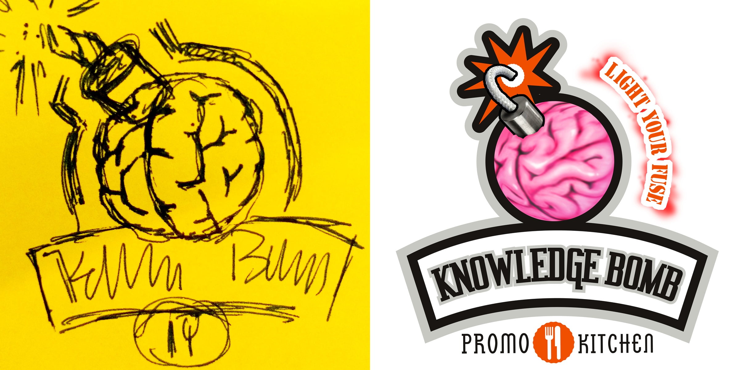
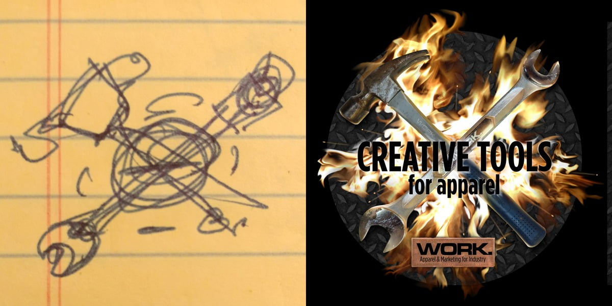
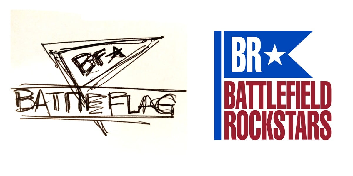
Here are a few thumbnails from recent work:
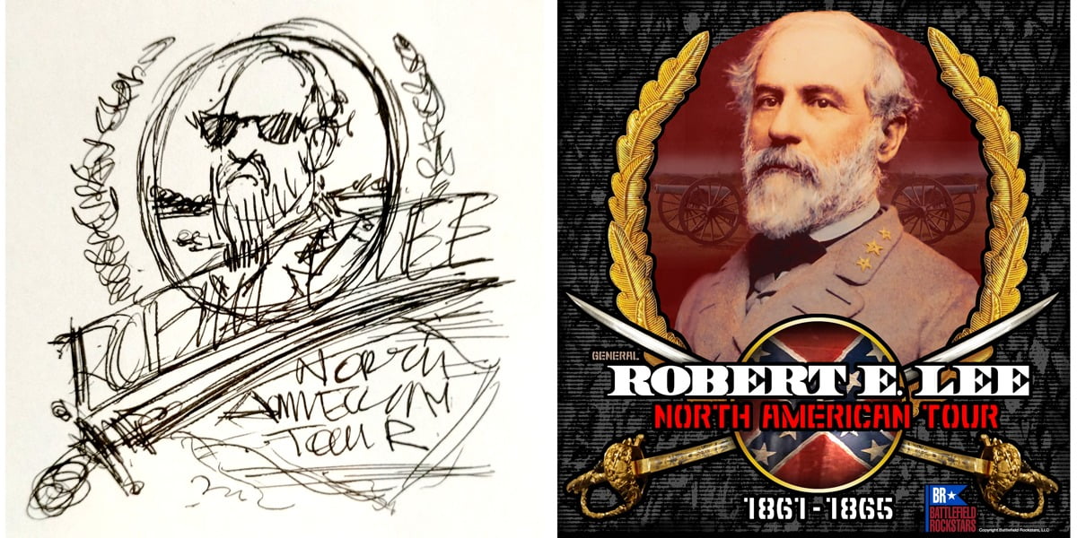
“A good plan violently executed now is better than a perfect plan executed next week.” – George S. Patton
“Simplicity, wit and good typography.” – Michael Bierut
“My favorite days are the days when I can get a lot of shit done efficiently and then somehow just enjoy it.” – Aaron Draplin

3 comments
Vic
Nice Article
Vic
cdhilbert
LOL….I *love* this line: Remember, there is no idea button on a keyboard.
Definitely needs to be on a tshirt and bumper sticker for designers!
Another article that you hit out of the park! I especially love the humor you threw in there….keep up the great work!
BTW, sharing!
atkinsontshirt
Thanks Chris!