There isn’t an easy way to calculate the thousands of designs I’ve seen produced over the years. It is mind boggling to even think about it. I’ve worked with some of the best and a few of the worst designers out there. Some images were so fantastic, even I wanted a shirt, and that’s saying something. On the other end of the spectrum, some were so incredibly poorly designed, I questioned if the file wasn’t some sort of practical joke or these days designed on Fiverr. “Uh, are you sure you want to print this?” Lame.
Like in any profession, the cream always rises to the top. Think you have what it takes to be considered a top designer in the apparel decorating world? Think again. Climbing the ladder in any profession takes dedication, skill and a willingness to work with an open mind and learn. Are you learning every day? Here are some things that I’ve picked up over the years or noticed from the good and the bad alike. Maybe you could apply them to your craft.
Decisiveness. You can always tell the confidence level of an artist. Are they making a bold move? Bam! You can tell right off if something is awesome. Don’t offer up any half-hearted weak crap. Go for the gold. This trait is lost amongst the trash you can see produced these days. Go to just about any retail store or online website. Everyone is copying someone else’s idea, theme, or style, and the lack of originality is over-whelming. And so boring. Want to be considered a design Jedi-master? Be yourself. Find your creative voice. Do something unique to you. Get that goofy idea in the back of your head out and into the world. Trust me; the world doesn’t need your take on the “Keep Calm” meme. You can do better.
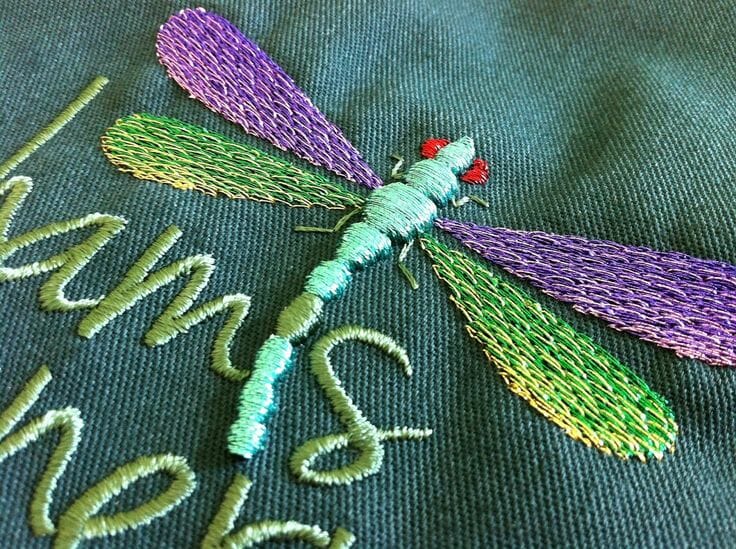
Regulate the Crayon Box. Thinking back to all of the great designs I’ve seen produced, I can truly tell you that the best ones weren’t more than five colors. In fact, some of the best designs ever produced were really only one or two. Just because you have 54 crayons in the box, doesn’t mean you need to use all of them. Often, simpler is better. It’s also less costly to produce. Sure, throwing an extra color or two in there may make your design “pop” more on the shirt. But is it really needed? Most of the time, five more certainly isn’t. Would a halftone of one of the existing colors work just as well? For embroidery, could you change the stitch direction or choice and get a better effect?
Great designers also understand that in a production environment, the decisions they make on their computer workstations also translate to time on the production floor. For a commercial shop, time is always going to equal money. Great decorated apparel designers know this and make smart decisions with their craft. Think about that the next time you are handing in that twelve color pile of craziness to get printed. For one hundred pieces… Really?
Image Quality. Even with different styles, great designers all have a feel of craftsmanship with their work. Elements in their designs are exact, and on purpose. Image decisions are made to support other elements. Lettering is kerned to perfection. The image has great balance, tonal range, flow and use of whitespace. Sometimes even how the designer has used the shirt ground color in the design has been maximized, as they know that this can be used for better effect. One of the great things about working with fantastic designers is that after a bit you start to notice their overall creative vocabulary that they put into their work. How they build their file and creative decisions they are making add up to their image looking a certain way, regardless of what the subject matter may be. Once others can pick yours out from a line up, you know you’ve arrived. If you spend your time copying other people’s designs that won’t ever happen to you, as you aren’t building your skills. There is a big difference between someone who writes songs and someone that can only play Guitar Hero. Do something harder and develop your creative muscles.
Software Technique Matters. Sure, you can convert your fonts to outlines. (You always remember that, right?) However, do you know how a quick Unsharp Mask can make a screen-printed Photoshop file really pop when separated? Ever have your black not print on your separations because you have it on the registration layer for some reason? What happens if you don’t check and leave Overprint on? Do you know how to choke down the underbase plate so less white peaks out underneath your colors in your print? Can you change the digitizing for your embroidery file so it can work on a dri-fit polo without puckering? What’s the difference between sewing a flat panel cap and a five panel cap? There are hundreds of art based tips and tricks that you can do to make your file craftsmanship better. The point here is to make sure you use them. I’m always amazed at the sometimes poorly built art files that are sent in by “professionals” that should know better. Just this past week we’ve had files sent in supposedly ready to go that were missing key verbiage on a file, had Pantone colors misidentified, or the art was the wrong physical size as it was smaller than the sample we had to match. It pays to double check for quality. It’s all about the craftsmanship and professionalism. If you don’t know, ask!
Imagine the Design on a Shirt. When you begin creating your art, usually the software starts off with a big rectangle as the image area. This just simulates a piece of paper really. I wish that the programs would make this optional. Apparel isn’t a rectangle. It’s fabric. It moves with the person wearing it. It looks different on men and women. Different fabrics produce different results in production as 100% cotton is handled differently than a 100% polyester dri-fit shirt.
Images that really work great are the ones that take into consideration the garment into the design. It’s part of the thought process from the beginning stages. Can you use the shirt ground color as part of the negative space? How will printing over or near the seam affect the image? Where do you place a full front image on a V-neck t-shirt? What happens to an image when you print it on a women’s t-shirt across the chest? (Results may vary)
Don’t just design something and throw it on a stock t-shirt template…take more into consideration. Printing or embroidering is a mechanical process. The garment will influence how your design is produced. Great designers take that into account and adjust for it, or better yet, use that to their advantage. Have you ever given that a second thought?
Who is Wearing It? Are you designing for a bunch of motorcycle driving, bearded dudes or a yoga class full of neighborhood moms? What design choices would you make that are different for each? What would be the same? Can you even design for both? I’ve seen some very talented people struggle with pushing out concepts for groups they don’t understand. How do you get into a mindset so you can comprehend what that market might enjoy wearing? Research. If you customer doesn’t hand you the answer, the quickest way is just to go online. Find a website or two, maybe even some Pinterest images and take notes. Don’t steal anyone’s designs, but think about the design choices that are popular. Color, texture, style, form, font choices…really anything and everything you see. Filter that information through your design aesthetic and push out something unique in your creative voice. Be yourself, but point the creative direction towards success with the intended group that will wear the apparel.
Ink or Thread Selection. True professionals know what they are choosing usually for their work. If you have some funky idea for a design that uses a specialty ink, metallic thread, or non-standard production process, do yourself a favor and talk to the shop before designing the file. They will give you some tips on how to create the file so it is easier to print or sew, and also how much extra that idea is going to cost to produce. Don’t get sticker shock when that little foil extra you want around that object in the design is going to blow your budget. Maybe using metallic gold will work just as well.
Also have an actual Pantone book or thread chart with you when you are choosing colors for your files. If you are just choosing them from your computer, the final results may look different in person. If your customer doesn’t know what a Pantone color means, educate them. You are the expert, right? Take the opportunity to show them the professional way that people in the graphic printing world communicate regarding color. We don’t just say, print this in red. PMS 186 is selected. It is crucial that you choose these colors and have them labeled on the file before sending it in to the shop. Clearly communicate your expectations regarding color. It is foolish to leave it to someone else’s decision.
Don’t Be a Jerk. At the end of the process you still have to get your creation produced. This means interacting with a print or embroidery shop. Everyone comprehends perfection and the need to get things handled a certain way. However, nobody is going to understand the need to constantly tweak and revise the file because you don’t like how it is coming out. Apparel decorating shops don’t handle Diva behavior well.
Having to adjust your file during or after a sample is being produced just says to the team running the job that you aren’t exactly competent with your skills. If you see something that you don’t like and realize you need a change, please don’t act like an ass to the production staff. That isn’t going to win you any points. Especially if what’s changing rests squarely on your head. Instead, try some humor and a professional outlook on the situation. We’re all after the same goal, happy customers. We’ve made changes before, but realize that any change you make is wasting valuable production time.

12 comments
chris
Perfectly stated, Marshall! Once again you have NAILED it! 😀
I have actually “lost” clients because I asked questions they didn’t know the answer to and I wouldn’t “just design” it. I’ve also been known to disagree, tell them why, sometimes they listen and sometimes they don’t.
As you noted, the color of the shirt is important…especially if you are using just 2 ink colors and the design they want is 3 colors, with one of their chosen ink colors close to the shirt color. (Texas flag on a carolina blue shirt with red and royal blue ink — no white anywhere!). Things that make you screame WTF!!!!!?????
atkinsontshirt
Thanks for reading and commenting Chris!! Just “do something cool” for art instructions has to be the worst. Put some thought into it!