
This week’s blog article is all about creating easy to use distressed pattern files that you can use to add some pizzazz to your graphic files. Nothing fancy, just solid technique. If you have ever bought a distressed pattern you are going to wonder why you wasted your money after you read this. Creating your own gives you the control, but also puts your creative spin on the design aesthetic.
I’ve been creating distressed patterns for years, and have found some great ways to build new and interesting distressed graphics just from my surroundings. What makes it even easier is that you can get started with just using your camera phone.
Ready? Here we go!
First Step
Grab your camera phone. If you are one of the six people on the planet that doesn’t have one, just use a digital camera. The benefit of using digital photography is the immediacy of the image. You can tell right away if the shot you took is what you wanted. Don’t like it? Take another. Or twenty. Get what you can use.
For our purposes, we are looking for interesting patterns, textures and contrasting elements that can be the basis for creating Photoshop textures that we can apply to graphics. The best are those that have strong light and dark juxtapositions, interesting positive and negative shapes, forms, and even some direction in their patterns. You want to look for something “different”. If you are trying to choose the right thing to take a picture, think about how you might use the image or how it might form the foundation for something else.
In about five minutes of walking around outside I found a few textures that I think might make some good candidates. For the sake of simplicity for this article, I’m going to apply the same technique in Photoshop to each of these so you can see how the patterns might differ. If this wasn’t for the article I might play with these some to create different effects, but I’ll just keep it simple today.
The six photos chosen will be Asphalt, Bush, Carpet, Concrete Aggregate, Grass, and Shrub Shadows. Here they are. These are all taken with my camera phone, and not altered in any way. After I opened each in Photoshop, I resaved them at 300 dpi, at 8” x 4.5” file size.
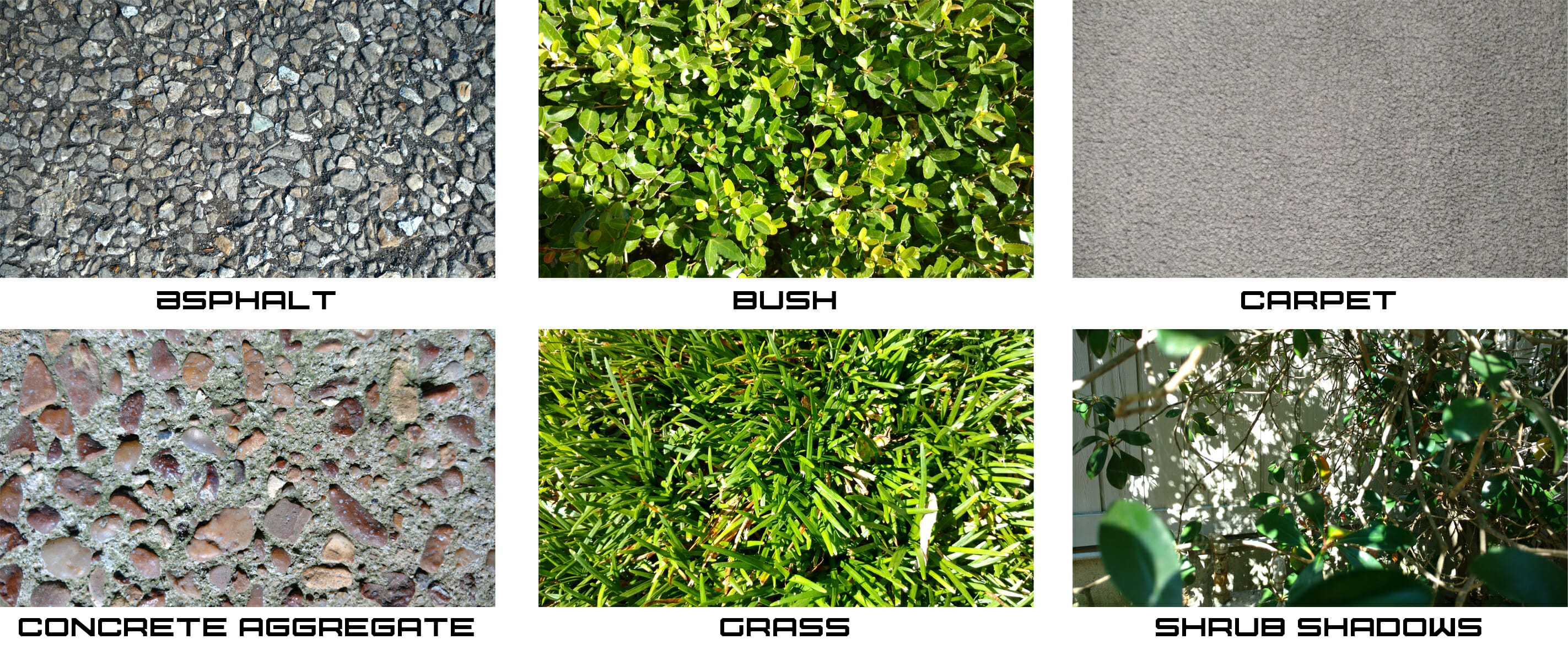
As you can see, nothing special. You can take these. In fact, you probably can take better shots of more interesting patterns. But I’m lazy, and went with the first thing I saw when I noticed.
In Photoshop you can spend a lot of time messing around with each of these to get the perfect balance of dark vs light, edge definition and all sorts of image improvements. I’m not going to do any of that. What we want here is quick and dirty, and ultimately, some unique patterns.
Second Step
For each of these photos, I converted the photos from RGB mode to Grayscale. While these patterns are already somewhat interesting, they are going to take on a entirely different feel as we want the randomness of nature and found objects to influence our look. The Grayscale mode is important as we’ll ultimately be converting each file to a high contrast file we can use. It will simply be black and white. If you aren’t happy with the tones in your Grayscale file, here’s your opportunity to change them by applying a quick Curve to them and get it the way you want it. For me, I didn’t change anything for any of these shots.
Third Step
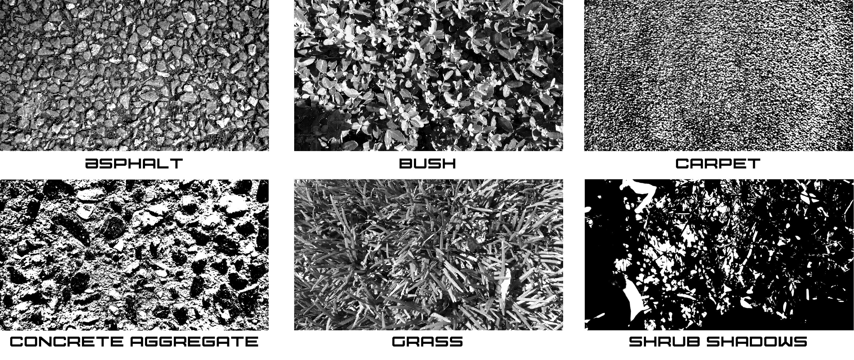
Now, here’s where the fun begins. Another mode change. Go from Grayscale to Bitmap.
This is going to completely remove all gray tones in your file and make everything either black or white. The trick here is to use the “Method” pulldown in the Bitmap mode command, and each of the selections offered produces a different type of look for your file. I would suggest trying them all out and seeing what works for you the best. For our purposes though, we only chose two.
50% Threshold, which just removes all of the gray and midtones completely and leaves a black and white pattern. There is no ambiguity here. This is the boldest selection and if you have the right pattern, often the most starkly creative looking in the bunch.
- Carpet Halftone was created using this method. I needed to punch up the texture first so I ran an Unsharp Mask on the file before converting to further delineate the shapes in the carpet.
- Concrete Aggregate Halftone was created, but this time I just went right from Grayscale to Bitmap, without any file adjustments.
- Shrub Shadows Halftone was created the same way as the concrete texture.
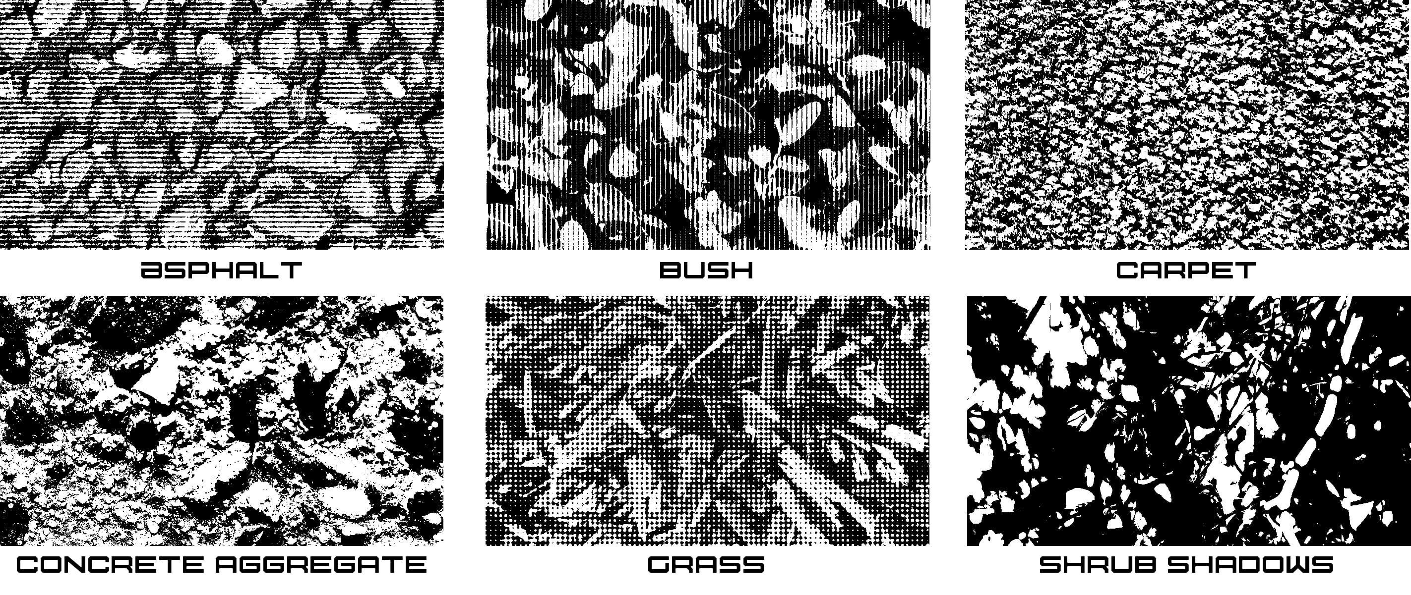
Halftone Screen, which converts your file to a halftone that you can use. The cool trick here is that you can select different types of halftone shapes, angles, and frequency (the amount of the halftone per inch). For my selections I chose to show some different patterns so you can see how they look.
- Asphalt Halftone was created using the Bitmap Halftone at 30 lines/inch, 0 angle degrees and with the Line shape. This produces a great effect that looks like old fashioned scratchboard, or maybe woodcut if the lines are thick enough. The 0 angle makes the lines go horizontal.
- Bush Texture Halftone was created the same way, but the angle was set to 90 instead of 0. This makes the lines go vertical instead of horizontal.
- Grass Halftone Texture was created by not using lines, but dots instead. The number variables where the same. 30 lines/inch, 0 angle, so the pattern is horizontal.
Here are the actual halftones I made. Compare with the shots above. Each of these files took maybe twenty or thirty seconds to process. These are huge time savers if you are looking to create something unique for a creative piece you are working on.
Below are the same textures, but with enlargements so you can see how each was affected by the choices made. What do you think? Could you use these for something in your design?
Fourth Step
So you are asking yourself, “That’s great Marshall, but how do I use these?”
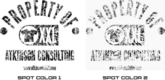
You know I wouldn’t let you down. For the purpose of demonstration I created a “Property Of” graphic to test out each of these files and see how it can change the look of the type by clipping it into the file. At the end of the process I could separate this two ways, and I’ll show you how to do that.
So here’s my graphic. It’s just a simple file, nothing fancy. It sorta looks ok already, but once we throw some of our new filters on this, it’s going to look even better.

For our demonstration I’m just doing this in Photoshop. It’s easy. I just copy and paste each of the final textures, and select the dark areas of the graphic. Invert that selection and choose the texture layer. Then click delete.
The texture layer is applied to the graphic, and I can choose the opacity of the file until I’m happy with the resulting pattern overlay.
Here are the results. I’ve zoomed in so you can see the detail. Which do you like the best?
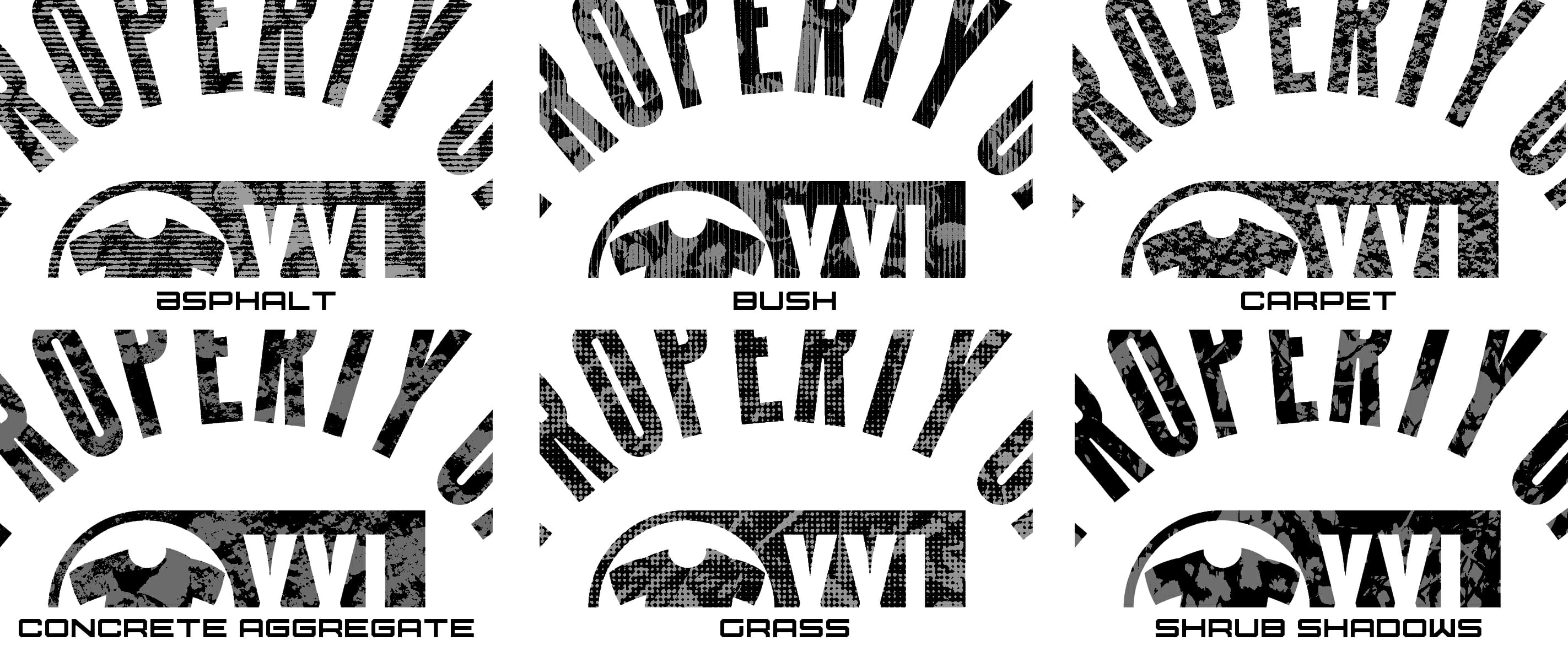

So I liked this one the best for my file, Grass. There are two ways to separate this file for usage.
The first is simply to just flatten the file and save it as a .tif and bring it into your vector program to print. This will make the Grayscale elements of the file print with the correct halftone dots and patterns you normally use. This would print as a one color. All day long.
Another method would be to separate this in Photoshop into two colors. One gray, one black. This gives you more control when printing, and you won’t be reinterpreting the halftones in the design. I like this control, but it’s two colors instead of one so your production costs will increase going this route. It is a little more work to get this, but in the end, it will be a better print as you have more control of the aesthetic as you can choose the colors you will be printing with in each screen. By the way, these are exactly the same steps I use when separating a file for simulated process seps. It’s ridiculously easy.
Here’s how to do this in ten easy steps:
- First, merge the graphic and the texture layer is it is just a single layer.
- Then, while still in Channels, click up and select the RGB channels. You are selecting your art file on the Layers now. At the top menu selections, choose “Select”, and then pull down to grab “Color Range”.
- In Color Range, you can select as much or as little of the area you want to grab. This is controlled by the “Fuzziness” slider. For our purposes, we are going to use the eyedropper tool and select the gray area we want to make into a channel. Make sure you have “Invert” checked so the background in this tool will be white.
- Select the gray area and pull the Fuzziness slider until you are happy with your selection. This grabs everything you want for the channel. This will have the “Marching Ants” show for your selection.
- Click the create a new channel button at the bottom of the palette. A new channel will be created and it will be automatically names Alpha 1. It will be a solid black square, but the “Marching Ants” will be visible. Just invert the art (“Command “I”), and deselect the “Marching Ants” (“Command D”). This will now show the graphic selection you have chosen on a white background.
- Double click the Alpha 1 channel. The Channel Options palette will open.
- Check “Spot Color”. Double click on the red square, and the Color Picker palette will appear. Choose Color Libraries, and pick the PMS color you would like this spot color to be. Back on the Channel Options palette, make the solidity 95%.
- Choose the RGB channels again to select your original art. This will unselect the new spot color channel for viewing automatically.
- Repeat steps 2-8, except this time you choose the Black areas of the design, not the Gray.
- Review and make sure everything is ok with your files. Then to split the channels to get them into a format you can use, just delete the RGB files and leave the two new channels. Choose “Split Channels” in the channel command section and save each as a .tif file. Each plate will be 100% to size and register with the other. Make screens with each and print away!

Thanks for reading! If you want to play with these files and try them yourself here are all of the original and final versions of the files for this article. Enjoy!
Click Here to get the files.
.
“A camel is a horse designed by committee.” – Alec Issigonis
“Good design doesn’t date. Bad design does.” – Paul Rand
“Anytime you see a turtle on top of a fence post, you know he had some help.” – Alex Haley


4 comments
John Drake
Unless you are total newby in this business, you created your distressing layers 10 or 15 years ago. Plus, there’s no point in creating something from scratch when Creative Market has hundreds of distressing files and brushes for dirt cheap.
atkinsontshirt
Thanks for writing John. I can assure you, I’m not a newbie in the business. This is the method I’ve been using for over two decades, so I’m just sharing it. Also, this point is to create them yourself, so you can have control and also make it work for you creatively. Creative Market is great, but you still have to pay and I like the DIY approach.
Jacque Lee
We make our distressed patterns in a similar but slightly different way. We place the bitmap .tif into illustrator as a blind knockout. It is a bit harsher than your photoshop method but works quite easily when using the same distress on a line of similar designs. It is very quick and easy to change out the background image and place the next in line under the distressed layer. We can knock out tons of these in a short time without having the do new photoshop separations. Much faster, much easier. Downside is you do not get the mid-tones or control over the greys unless you make two separate bitmap .tifs and layer them up in illustrator. Great tutorial, thanks!!
atkinsontshirt
Jacque – yep…I mentioned that in the article. I just wanted to keep everything in Photoshop for the piece. Thanks for reading and commenting! -M