That’s right I said it. Bring the hate.
And by baby, I don’t mean your offspring. I mean your t-shirt design, embroidery idea or product plan for your new apparel line. Whew. Are you sure you are going with that?
This is something that nobody is going to tell you. Especially your apparel decorator.
Why you ask?
Well, basically they just want to produce the order and get the business. Even if it is only for that one time when you order. Because you know. Your baby is ugly. There won’t be a reorder…they just can somehow tell; but they are just too polite to tell you.
The standard mantra long used in this industry is “We don’t have to wear it.”
They might hint at the ugly baby a little bit. If you hear something that sounds like, “Have we told you what a great art department we have?” That’s a nudge in the right direction. Not that you are listening.
Confirmation Bias
So what’s going on here? Why are you so convinced that your baby is pretty?
In technical terms your problem could be what’s called “Confirmation Bias”. Have you ever heard this before? This is when you get so invested into your idea that you don’t really go out of your way to find out the real truth about it.
Read these below and see if applies to your case:
Limited discussions with only people that you think will agree with you. When you showed your business plan or line of shirt designs to your Mom and she said, “That’s nice.”, that counted as confirmation bias. You never bothered to get a contrarian point of view. So now you are stuck with a garage full of t-shirts that nobody wants. Not even your mother.
Market survey questions that are designed to only agree with your viewpoint. When you ask, “Which of these designs is better?”, you are failing to ask if either are any good to begin with. That’s the instance when both babies are ugly. Ewww.
Writing off people that don’t agree with your ideas as haters or idiots. This is extremely common in online forums or groups. There is a really shaky line between being a troll and just being honest. Which is probably why a lot of people just don’t choose to comment. Worse, is they sanitize what they really feel to just be polite. Experience has shown them that if they wrote what their honest opinion may be, they will get labeled as a hater or idiot. Who wants that? Better to play it safe and just serve up a big bowl of vanilla. Enjoy!
In a subjective discussion all viewpoints matter and should be respected. Online though, it is the wild west and people post all kinds of stuff. It is trustworthy though? That’s the big question.
You should start with asking people that can give you a critical critique without fear of repercussion. Maybe that isn’t in an online setting. Be prepared and have a thick skin. It’s not a personal attack on your soul if someone wants to change the typestyle or make that thing blue. Lighten up. This is what you want, right? Honest feedback?
Maybe ask a few questions that elicit more helpful answers:
“What’s wrong with this design?”
“What’s the one thing that you would make you NOT buy this shirt?”
“What would you change to make this better?”
“Does this fit in with our brand?”
Ask a good number of people independently of each other. Take good notes. Pay attention. Don’t argue. Make the necessary changes if you can.
Supportive Bias
Want some more vocabulary thrown at you on the ugly baby idea? Let’s talk about “Supportive Bias”.
Supportive bias is about defending your idea to the death because you already spent sooooo much time developing it. This happens constantly with creative artists when they present an idea to a client and the client hates it.
They then spend a insane amount of energy either trying to convince the client that the baby is pretty, or they close a door somewhere and throw a profanity laced fit about how stupid the client may be. Either way it is a waste of time, because the client still wants a pretty baby.
That art isn’t going to redesign itself.
If your design idea doesn’t work, the amount of time spent on it is irrelevant. Don’t get caught up in that trap. You have to let go. Make the changes needed, but reassess how you arrived at your creative concept to begin with.
Pretty Baby Creative Origins
So how do you get to the point where the design will win a pretty baby contest, and you can high five everyone you know?
First, be honest with yourself.
Do you really have the skills for designing? Should you be doing the work in the first place? If the client wants a particular style, but that’s really not your cup of tea, then it could be a long, painful road ahead.
Sure, your idea might be sound, but your execution of it just won’t be so great. Trust me, it is perfectly ok to bring in someone with talent. And by talent I mean a real professional. Not your neighbor’s kid next door that just finished an art class. Does “good enough” ever work?
If you had to have open heart surgery, you wouldn’t trust the operation to someone that just happened to have a set of steak knives in a drawer, would you? Why trust your creative idea to some hack either? If your apparel decorator doesn’t have an art staff, there are plenty of wonderfully talented freelancers out there. Get. Some. Help.
So let’s say that you do have the talent, or you have your creative ringer all lined up. What’s next?
Get your idea down the old fashioned way. Research. Some thumbnails for layout. Hammer down the exact specifications for the job. Don’t invest a ton of hours into building the design file until you have nailed exactly what you want to do.
Everything matters. You’ll need the shirt style and color before you start designing as this can affect your choices creatively.
For example, using the garment color in the design to help modulate ink color hue on the shirt is a great strategy for printing for a long list of reasons. If the shirt color hasn’t been decided, that could affect design choices made when building the art. Another example would be to be judicious in your shirt style selection; using a burn out t-shirt for an embroidery applique or high density gel print job wouldn’t be the wisest choice. The decoration will just be too heavy.
If you don’t know what shirt style and color you’ll be using, all of your efforts in the design phase could be wasted because you may be making the wrong choices without knowing it. Ugly baby trap ahead.
Making the Baby
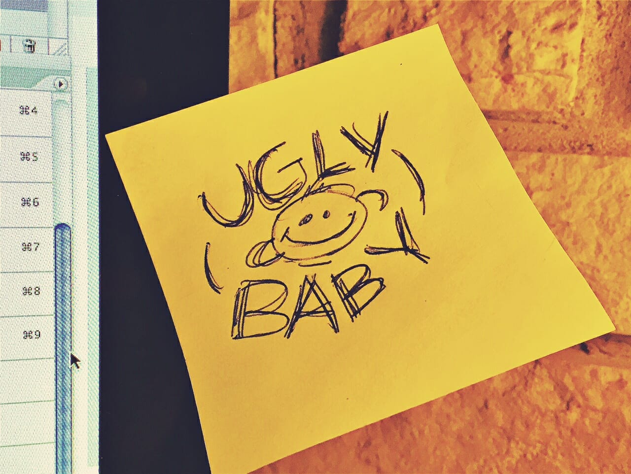
To me, the best designs always start out with a rough sketch or a quick thumbnail. This is a lost art. Personally I like to doodle mine on small Post-It-Notes as they are cheap and disposable. Each little square is perfect for scratching out an idea. Nope, that sucks…do another. You can grind down a dozen very quickly. Once you find one you like, it’s easy to just stick it to the edge of your monitor for reference and then start the work building your file.
If you have a picky client shoot them the thumbnail and ask “Hey, is this what you have in mind?” When they say no, you’ve just invested about three minutes into the concept. But now, you can have an in-depth conversation with the customer about what it will take to make that baby pretty. If your choices aren’t what they are looking for, get them to describe it differently.
Getting some critical thinking early into the process can mold your creativity into some better channels and push you into the right direction faster.
There isn’t an idea button on the keyboard, although many designers these days search for one continually. Great ideas start off with sound concepts. Buildings are built with a good foundation, and design works the same way. It is harder work that takes more creative skill, but in the long run better because you are developing your own creative vocabulary and style. Copying someone else’s style and taste does nothing to support your own.
Loaded Baby Diapers
Another great trick to use in the prep stage is to ask what shouldn’t be included in the design. This is an incredible time saving trick, and in keeping with our baby theme these are the loaded baby diapers. Nobody wants them, and you have to change them immediately. They just stink. Use your client’s answers to direct your energy the right way.
“I want a dragon, but not a fire-breathing dragon.”
“The St. Paddy’s day shirt should include a shamrock, but not a leprechaun.”
“For the fishing tournament shirt, we just want the fish jumping out of the water. No fishermen or boats please.”
Can you imagine your frustration if you spent hours creating that fire from the dragon, a leprechaun that doesn’t look like it jumped out of a cereal box, or all that incredible detail in the guy in the fishing boat catching the fish?
It doesn’t matter how good it looks if you have to erase it. In the end if you hear “That looks awesome, but not what I wanted.”, that’s the ugly baby’s crap-filled diaper.
You’ll need to change it.
You can’t blame anyone but yourself. Asking the right questions and doing the legwork on what’s needed for the design puts you in a winning position as you have eliminated a few possible missteps.
Baby Beautification Fee
Recently someone told me about some trouble getting some design work handled. The artist kept submitting designs to the client and they hated them. Ugly baby. Revision after revision was presented. Still ugly.
But now, the artist’s supportive bias kicks in. They say that the designs were fine. If more changes are needed, they are going to need to be paid more money as they have spent a lot of time on the project already.
The problem with this situation is that the artist wasn’t listening and executing what the client requested. That’s the reason for the changes. A death grip on an ugly baby doesn’t lead to a positive outcome.
In the end, they just went to another designer. This one listened. That baby wasn’t ugly.
So, here’s the question…when faced with this same scenario should you be charging to make the baby prettier? How many changes do you allow until you think they are excessive?
In my opinion, you don’t charge for revisions. It’s your job when you take on the project to deliver a pretty baby to the customer. Having robust and exact directions on what they want should be the first place you start. This is often called the “discovery” phase of the project.
When the customer gives you the “do something cool” instructions (why does that always happen?), it’s critical for you to drag out what exactly will meet their expectations. Because what the customer thinks is cool, is often vastly different than what the artist considers cool. Nobody is equipped with telepathic powers, so this has to be a dialog. Get these instructions written down, and have everyone agree to them in advance of creating the art.
This holds true when you are your own design customer too. Don’t just pull something out of thin air. Jot down some guidelines to use when you are developing your idea and have these based on research and facts about the user demographic.
Sound decisions, good information, a solid concept for a foundation, some creative sparkle and hard work all add up to pretty baby DNA. All you have to do now is birth the baby.
Congratulations!


3 comments
Stan Holt
Marshall,
Good stuff, goes for everything type of design, not just apparel.
LOL, I lived the fishing art story years ago before digital, all done by hand, erased by hand too.
Same guy said computers and doing artwork digitally was a passing fad. 😉
Jennifer Cox
Thank You Marshall, for coming right out and saying it! This is an ongoing challenge that every apparel decoration professional faces when presented with customer-generated art!
atkinsontshirt
No problem Jennifer! Thanks for commenting! -M