Do you use Photoshop for creating the image for t-shirts either digitally or with traditional screen-printing? How adept are you at setting up a foundation for amazing print results with just a few simple clicks?
Many creative digital artists struggle with Photoshop because there are too many choices to adjust the image; they simply don’t know the tools or get caught in a rut when processing their files.
Like working with pizza dough, they simply overwork the image. (Sorry, but you do not need a lens flare. Just stop it.)
What if I told you there was some secret Photoshop magic, that’s easy to use, has only two steps and takes two minutes or less to get to amazing results? Today you are in luck, as we are going to unleash the power of the LAB channel.
Say what?
That’s right. The LAB channel. It’s not a bundled cable package you get with Showtime or HBO, instead, it’s a very powerful image color space in Photoshop that can save you hours of time tweaking your files for print.
You’ve bypassed this powerful tool for years I’ll bet. Raise your hand if that’s you. Yep, I knew it.
RGB to Start
Here’s how it works. We are going to start with our image in RGB. RGB stands for the Red, Green and Blue channels and is the traditional additive color space…meaning that the three color channels added together form the basis for the total color gamut. LAB uses that same color space but divides it up into three completely different channels: Lightness, A, and B. The Lightness channel is simply the luminosity or the greyscale, if you will, of the image. The A and B channels are all the colors of RGB but just divided into two color channels instead of three. (I know, don’t hurt your brain.)
There are a few things we can do immediately that will macro improve any image and save you hours of time. The first is tweaking with some simple curves with an Adjustment Layer, and the second is using an Unsharp Mask step.
Before we get too far into this, I want you to open a photo in Photoshop and play along. Use one that’s a raw file and unprocessed or not improved yet. That’s how you can learn quickly. Learn by doing, it’s the only way.
Seriously. Open up a file.
But first, don’t screw up a file you need. Open something that you can use, and then make a copy of it. Save it as “LAB Test”. That way I won’t get any angry letters about you screwing up your client’s only photo of Sasquatch. Yikes.
LAB Color Space
Next, convert your image to the LAB color space. To do that, just click “Edit” on the top menu and then choose “Convert to Profile”. From the dialog-box drop down, choose “LAB Color”.
You won’t see any immediate change to your image, but you are now poised like a ninja to strike and make some fantastic improvements.
Third, create a Curves Adjustment Layer. Just click on “Layer” from the top menu, and choose “New Adjustment Layer” on the pull-down, then “Curves”. Click “Ok” in the box that pops up. This step creates a new layer in the file so you can toggle back and forth and review your handiwork as you change the image. Of course, you can skip this step and just alter your original file layer without it, but that’s like working without a safety net. If you are feeling dangerous, or just love the History tool, then don’t worry about this step.
Now comes the fun part. There is a drop-down menu near the top of your Adjustment Layer. Click on it and you will see three choices. L Channel, A Channel, and the B Channel. To start, click and select the A Channel. (If you aren’t using the Adjustment Layer just do the steps below by choosing Command M and go to “Curves”.)
The Photoshop Histogram will appear. If you normally use this tool, it will look dramatically different than what you usually might see, as the graph will show a huge spike the middle. That’s normal in LAB mode. For our exercise, we are just going to adjust the endpoints of the Histogram graph. Simply click and drag the black endpoint of the diagonal line in the graph until the Input number reads -90. Now do the same for the white endpoint, but you want 90 instead. Your Input numbers should be the same, but because they are on opposite ends of the graph, one will be negative and the other positive.
Don’t worry about what your image looks like at this point, because it may look a little weird as you’ve only finished half of the correction. We’ll need to adjust the B Channel next to balance everything out.
Go back to the Adjustment Layer drop down and it currently shows the A Channel. Click on that and select the B Channel. Repeat the above steps for the B Channel, with -90 and 90 as the new Input numbers for black and white respectively. Abracadabra: your ninja Photoshop magic has struck!
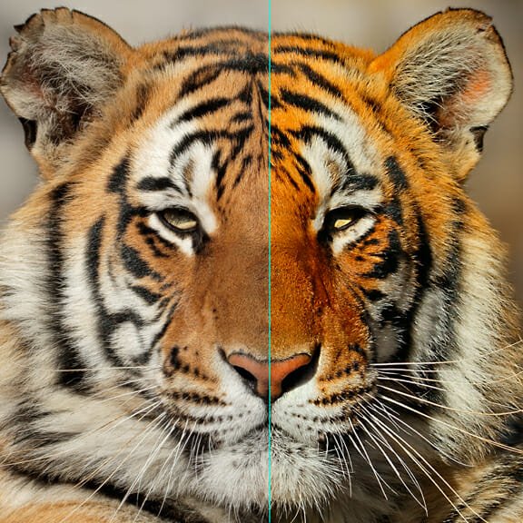
Now check out your results by simply toggling your Adjustment Layer on and off. Your image should look dramatically better, similar to the right side of the photo of the tiger above. What happened is that you’ve globally increased the color range of the image. I always use -90/90 to start, but if your image still needs some tweaking go back and adjust your Histogram with more or less depending on the results you want and the image you have.
Once you get good at this step, you’ll find it is a great starting point for any Photoshop file you are working with. For images that already have rich colors, you won’t see much change…but if your file is muddy it will make an incredible difference. This works great with any image sourced from a camera phone, especially if the overall image looks gray and flat.
Unsharp Mask Zing
While you are still in LAB mode, click on the “Lightness Channel” to select it. Then go to Filter and click “Sharpen”, then choose “Unsharp Mask”.
Because you are working in the L Channel, everything you do only affects the luminosity of the image, not the color. Making adjustments to this layer, independently of the color, greatly affects the “pop” of the image. For t-shirt screen or digital printers, this will become your new secret weapon. And who doesn’t want a secret weapon? Muhahahahaha.
The reason this matters so much is that t-shirts are essentially printed billboards. Viewers only have a few moments to get the full impact of what they are seeing as nobody is just standing around waiting for you to view their shirt image. Adding a little zing to the image can boost its appeal to the viewer. This effect works wonders with textures, tiny details and patterns.
Check out the Tiger in the picture for this post. What gives the fur and whiskers the extra dimension is this Unsharp Mask step. Compare the left and right side of the tiger photo. That’s about thirty seconds of effort, maybe less. I probably did it a little too much, but I was trying to make a point. It’s what got you to read the article, right?
In the Unsharp Mask filter, there are three sliders you can adjust. “Amount”, “Radius” and “Threshold”. For “Amount”, the more you slide the selection the right, the more intense you will alter your file. The “Radius” selection simply grabs and combines the pixels in an area, so the more you slide the selection to the right, the bigger image grab you’ll get. “Threshold” works a little differently, as the more you slide to the right, the more greyscale levels you are selecting at one time…so the effect is minimized as you slide.
The only way to learn what happens is to just play with each until you are satisfied with the cumulative effect of your choices. What will happen is that the bright white and deep black parts of the image will increase in intensity the more you use the sliders. For textures such as hair, woodgrain, feathers, corrosion, crinkles, crevices, and any highlight or deep shadowed areas will suddenly bounce in the image. Remember, this doesn’t affect the color. Be careful though, like adding salt to a recipe you can go too far and ruin the result. Unless of course, that’s the craziness you want. You rebel you.
Once you are satisfied with the results, click “Ok”. This Unsharp Mask step can save you hours of time by not having to use the Dodge and Burn tools at all in your image. Just be sure to revert back to RGB mode and continue your separations or work for production.
When you get the hang of these two steps, you can easily adjust any image in two minutes or less and tremendously improve how they will perform for printing. Another great thing about this process is that the file has been changed on a macro level, but with details intensified on a micro scale. All without selecting any area, using any other tools, or any wasted time.
Open. Convert. Color Change. Unsharp Mask. Convert Back. Save. Done. Creative Hero.
Don’t take my word for it though…try it!
Here are some examples of different types of photos. All of these were processed using the same settings and steps as the Tiger photo, including the Unsharp Mask step so you can compare how it affects the photos differently. All of these photos had about two minutes of effort at best correcting them.
Think about how you could use this technique in your image development!
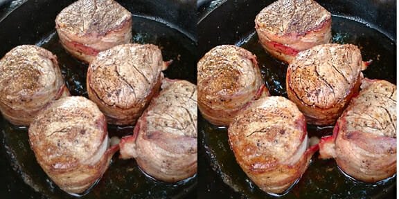
Example One: Filets in Skillet. I took this shot with my camera phone while camping. Yes, they were wrapped in bacon. Because, you know…bacon. Which one would you eat? Vegetarians need not answer. BTW, these were delicious.
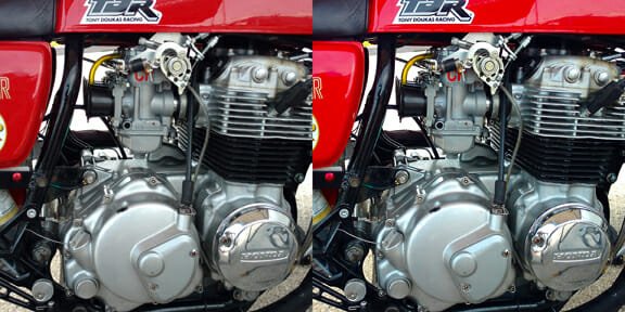
Example Two: Motorcycle Engine. Another camera phone shot. The Unsharp Mask brings out the detail in the engine parts, and gives the metal some better dimension. Notice how the red paint on the left, that was bright to start with, even looks better.
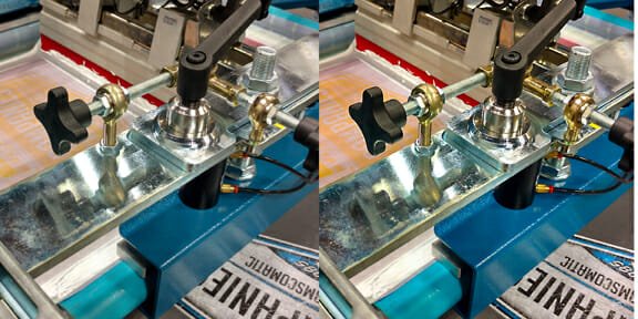
Example Three: Printing Set-Up. Looks like your shop, right? The colors intensify, but the Unsharp Mask is just a little too much. Notice the halo around the black knob. I’d dial that back a bit. This makes the chrome pop though. Remember, this was all done on a global level without zeroing in on any one part of the image.
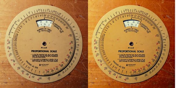
Example Four: Proportional Scale. Hey, what is that? Old guys like me used to use this to determine the correct percentage to enlarge or decrease an art object before computers as nobody likes to do math. Especially me. For this photo the color improved, but the Unsharp Mask was too much for the type details. Yes, you can go too far…and the results on the right prove it. However, check out how the woodgrain and scratches in my wood work table look more interesting now.
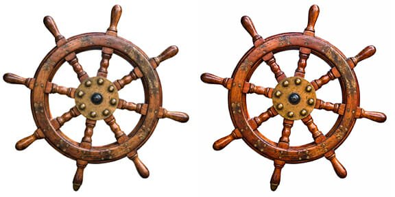
Example Five: Ship’s Wheel. I bought this stock photo online for a t-shirt design project recently. It improved the results, don’t you think? All I need now is a cool breeze and a rum drink with an umbrella.


3 comments
DerfP
Can’t seem to follow the last part “While you are still in LAB mode, click on the “Lightness Channel” to select it. Then go to Filter and click “Sharpen”, then choose “Unsharp Mask”.
– When I use the pull down “lightness” in the pictogram menu, nothing happens when I apply Unshapen Mask. If you mean using the actual Channel (from Channels) it won’t even let me pick a filter when I have that channel selected…
What am I missing?? Love the color adjustment, just want the magic sauce!!
atkinsontshirt
First, thanks for reading!
Just go to the Channels area, similar to Layers. There should be three. Lightness, A & B. Click on the Lightness channel, similar to how you might select a Layer. Then you can use Unsharp Mask or edit the channel in other ways.
A.Atila Guney
All the samples and explainations are
so clear ,step by step. Thanks.