Because you absolutely needed another list in your life, here’s one that focuses the most prevalent errors inexperienced folks run into when designing art for t-shirts. Someone has to do the creative work, and if that someone is you – read on!
The formula for success = 50% Shirt Style + 50% Great Design.
Let’s break those numbers down shall we? Before you even start designing, the first step is to think about the shirt that will be printed. This is such a crucial choice as the color, texture, thickness, weave, material, dyes and other specifics can directly impact the print production for the shirt. How well do you know your target demographics for the t-shirt? Understanding these specifics is probably the single most important factor in choosing the shirt. Are they teenagers, or middle aged beer-swilling fat guys? Big difference between them, and the shirts that they would enjoy wearing; as the teenagers would probably opt for a slimmer, lighter weight fabric with a more fashion cut, but the brew-crew would pick out a heftier, wider and more substantial shirt. Tip: Pick the shirt first, and then review the color palette. This saves a lot of time, as not all colors are available on all shirt styles.
Once you’ve picked out the shirt style, review the color palette and choose the hue that’s right for your project. As a rule of thumb, the darker the shirt the more expensive it’s going to be to print. Some colors have limited availability, so choose wisely. Also, the most common colors to print on are White, Black, and some form of Grey. Red, Royal, Navy are good second place choices. If you are trying to sell the shirt, pick a commonly used color if you want to appeal to the most number of people. If you pick another color, some people won’t buy your design just because they won’t like the shirt color, regardless of how great the design looks. (Trust me; you’ve done this yourself – right?)
The other half of the equation will always be the design. Regardless if you are creating this yourself, or outsourcing the artwork to someone else, keep in mind that the more complicated you make the design with adding ink colors and print locations (front, back, sleeve, etc.) the more expensive it’s going to get to produce. A white shirt with a one color black imprint will always be cheaper than a black shirt with a four color front and eight color back.
A few points before getting started designing your t-shirt art:
- Contact your printer before designing anything and ask what design software they would like the files created in so they can separate the file easily. Can you use Word or PowerPoint to create your art? Sure, but chances are nobody can print it. Do yourself a favor and ask this important question before you spend all that time slaving over your computer with your creative masterpiece. Tip: The three most commonly used software platforms are Illustrator, CorelDraw & Photoshop.
- While you are talking to the printer you should ask for the maximum imprint dimensions – this is going to be the absolute limit you can size your artwork. This may vary from printer to printer as they may be using different equipment. Tip: Art that is sized with a 12” width can be used for adults and all the way down to a youth 10-12 with the same set of screens.
- Since you now know the shirt color and style (remember, you picked it out first!) you can now decide how many locations on the shirt require a graphic. Remember, every time a location is printed it requires screens, ink, set up time, production time and labor. I keep mentioning this as there are people who never seem to understand this when it comes to quoting.
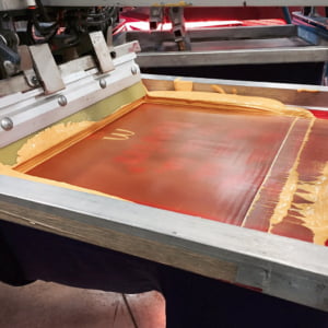
- Think about your graphic and count up the number of colors required. If you are printing on a dark shirt you may need an under-base for the design. This acts as a foundation for all the other colors to print on top. More often than not the screen uses white ink, but you can use other colors successfully. If you need white in the design on a dark shirt, you are going to need an extra white plate too. A common term for this is “wet white” as it’s usually the last color to print before the shirt is removed from the press and sent down the dryer. If you add up all these colors (# of colors of the design graphic, the under-base plate, and the wet white plate) you get the total number of screens used for a print location. This is what you are being charged for when the printer works up the quote.
- Besides your shirt quantity for the order, this is the number one factor used to determine your price. Most shops charge between $20-$30 per screen. This is why you see a multi-color graphic on one side of the shirt and a one color graphic on the other – they were simply trying to keep their costs down. Tip: I always advise people to get the shirt quote before working up the artwork. This allows you or your artist to understand the “rules” before designing anything, and keeps your production costs lower.
- What happens if I am made of money and don’t care what anything costs? Then these rules don’t apply to you, and you should come see me…I’ll be happy to help you with your next project!
The Artwork
Ok, so now you have the cost of the shirt project nailed and you know exactly what to do. Get out of my way, and let’s start designing! “Wait, hold on cowboy…” Let’s think about a few things first to make the design process go a little smoother and take a little less time. There are a few tricks that can make this process a success.
- Create a bunch of thumbnail sketches before touching your computer. These quick and messy sketches will help you work out the design elements first. Where should the headline type go, what’s the overall shape of the background, where should you place the flaming skull of death, etc? Tip: I like to use Post-It-Notes as a thumbnail pad, as I can scribble up a few of these quickly and then after I know the general layout just stick one to the side of my computer monitor. This is a good reference tool and doing the actual work on the computer is just a matter of executing the construction of my idea, rather than fiddling with the overall idea itself.
- Sometimes reference material helps with the creative process. I’m a big fan of collecting ideas in a notebook, doodling in a sketchbook, or even keeping a folder on your computer, with the purpose of having a well spring for ideas. I can’t tell you how many times this activity has led to me pulling one element or another from a visual I culled from another source and turning it into an awesome design. Sometimes the shape, a texture, a font treatment, or something will strike up an idea and I’ll start doodling up a new idea on some paper. Tip: These days I’m using Pinterest as an easy tool to gather images that I find interesting. Here’s a link to my “Design” board that has some great type treatments, logos, layouts, illustrations or designs: http://pinterest.com/atkinsontshirt/design/
- If you are designing for a client or another person, a good idea is to have a short discussion about what they would like to see in the design. Ask them to describe the overall feel of the image, and translate it into a few words: professional, funny, playful, bold, classic, athletic, cultural, iconic, pretty, masculine, technological, etc. This helps sort through some different design flavors that you might have and narrow down some ideas.
- Another great trick is to talk to them about what they DON’T want to see on the shirt. For example, let’s say you are tasked to design a fishing tournament t-shirt. You spend hours getting the logo just right, and your image has a great illustration of a fisherman pulling up what appears to be the nicest fish anyone
has ever landed. You show it to your client and they hate it, because it has a guy in it. If somehow you could have pulled the detail out of the client they would like to center the graphic just on the fish and not the fisherman – then you won’t have to “go back to the drawing board” and start over when they don’t like your initial concept.
Ready….Aim….Fire
Now at this point you have a lot going for you with this design. You have the shirt color and style, you know the maximum size for the graphic, how many ink colors you can use, and a basic thumbnail sketch of the design. By starting your concept this way you aren’t looking for the idea button on the computer keyboard. (Trust me, it isn’t there) Now, all that is left is your execution of the design. When crafting your image, here are a few things to keep in mind:
- Make sure everything is spelled properly. Use your spellcheck, or maybe just your finger, to review all words, numbers, phrases, etc. in your design. This seems obvious, but you would be surprised to see the number of misspelled words that we catch on the shop floor from outside designers.
- Big squares or rectangles used as background elements are the sign of a lazy designer. This says to the world, “hey, I needed something behind my logo and I couldn’t think of what to use. I’ll just throw a gigantic shape back there.” Just say no.
- Someone has to print this and someone has to wear this. Think about both of these when crafting your image.
- Take the time to have some craftsmanship in your work. Kern your fonts, use consistent outline thicknesses and elements. Make sure design elements relate to each other well. Quickly thrown together ideas always look sloppy and unprofessional.
- Did you add in any extra elements just to jazz up the design? I often delete them and do the “command z” & “command y” trick back and forth and see if it REALLY needs that “thing” in the design. More often than not, it looks better without whatever it is. Simpler designs are often better.
- Whitespace is your friend. Give some breathing room to elements in the design.
- Not really a fontophile? Don’t mark yourself as a newbie. Here are some typefaces to avoid: Comic Sans, Bradley Hand, Brush Script, Papyrus, Courier, Algerian, Hobo, Mistral, Curlz MT, Kristen ITC, Vivaldi, Viner Hand ITC, & Souvenir. Probably some more I could add too… Do yourself a favor and just say no.
- Get designing already! Don’t be afraid to fail. If it starts heading like it’s not the masterpiece you thought it was going to be either make some changes or stop and start over.
So there you have it. Hopefully one or two of the nuggets listed above will help you along the way on your creative journey. If you need some help with anything – just shoot me an e-mail and let me take care of the problem for you matkinson4804@gmail.com.

27 comments
specialtunlimited
Reblogged this on .
Chad Battles
I’m opening an online t shirt business in the near future. I’m not much of an artist or graphic designer. Do you know of an artist or someone that would be willing to work with a small start-up to make a good design to go in my shirt?
atkinsontshirt
Chad: – shoot me an e-mail with your information and I can send it to some artists I know. Be sure to include a creative brief on what you need, and also your rate of pay for the designs. (Flat rate, royalty %, per hour, etc.) – matkinson4804@gmail.com
Kellie Thomas-Walker
Very thorough article Marshall. If you ever want me to whip up some sketches let me know
http://www.KellieThomas-Walker.com
My Pintrist under my name has some ideas you might like to peak at also my board “Art is Life” has all sorts of works.
caroline
Excellent and well written article. Thank you for your insight. (Excuse me, I have to go change four fonts on my latest tee shirt design!)
Brett Grossmann
Interestingly enough..big square designs are in vogue. I don’t think the formula is 50/50. With so much selling online, the shirt comes second. It becomes like 60/40 at best. At retail you can feel the shirt. Most designs can be manipulated to work on several color grounds…after the fact. Still all in all…a point by point break down of every mistake the new artists makes when creating a shirt. Nice.
Richard Reilly
Great Article Marshall. I could add to your list of fonts yet you did cover some of the major ones. A must article every shop owner and artist should read.
roy bartels
Great article Marshall, I’m going to review this with my sales staff.
atkinsontshirt
Thanks everyone! Love hearing from you on the articles. It’s always fun to share… -M
Kevin
Wow great read as usual.
Thanks for tips and I pass the information on to my designer.
Chas Spain
Hi Marshall – super article. From a woman’s perspective much would be saved by not allowing men to buy T-shirts in an unsupervised way. My brother makes a mission of buying ‘bad’ T-shirts for his poor son -ie with misspelt words and unfortunate translations into English etc. When my (unsupervised) husband bought a TShirt in Athens with Greek characters I was sure it said ‘Hi i’m a fat white guy who can’t read Greek.’ and not some illuminating quote from Aristotle.
Conversely however – my other brother (a talented artist) made me the best T-shirt ever which was a hand screened print of a quarter sun on calico stitched onto a beautiful square cotton T. I wore it out and wish he had made more.
benhastie
Reblogged this on multimediaus.