Plenty of folks or art departments in this industry struggle with separating simulated process spot color seps for Photoshop. Let’s face it, getting others to do it is its own offshoot industry.
But, it’s fairly easy to learn. Especially the old school way that was taught to me.
In this article are the step-by-step instructions on how to separate your artwork from a CMYK or RGB Photoshop file into spot colors. I’ll walk you through it.
I’m using the latest Adobe Cloud 21.2.0 Photoshop release at the time I’m writing this article. If you use an earlier version of Photoshop or another design program, your software may differ, but you could probably squeak out similar results.
Try it anyway!
Start Your Simulated Process Spot Color Seps Here
We start the process by making sure our image has a few things.
- The file is unflattened. We need to be able to turn the layers on and off.
- It’s the correct resolution. 300 dpi at the actual size you are going to print the file.
- The design is complete. No changes. Everything should be ready for the separation process.
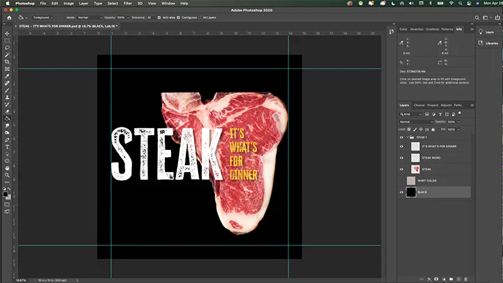
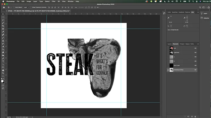
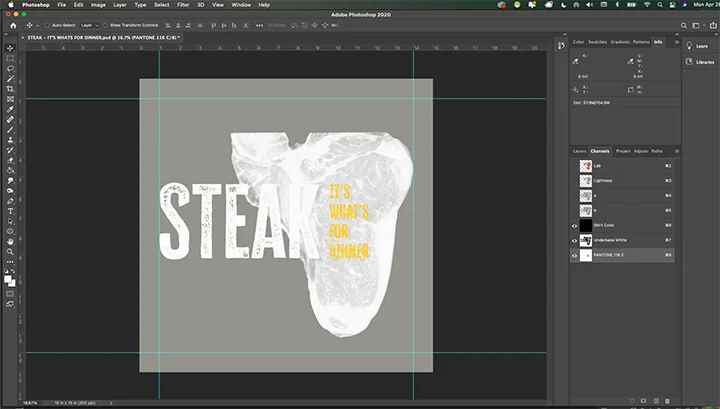
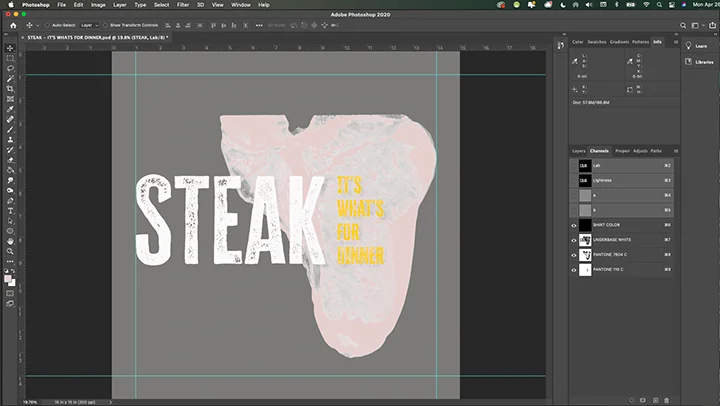
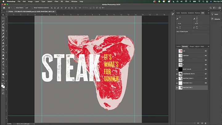
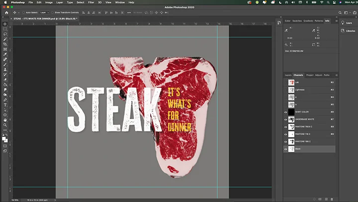
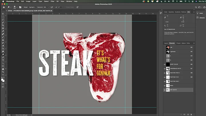
Here’s the file we will be using today:
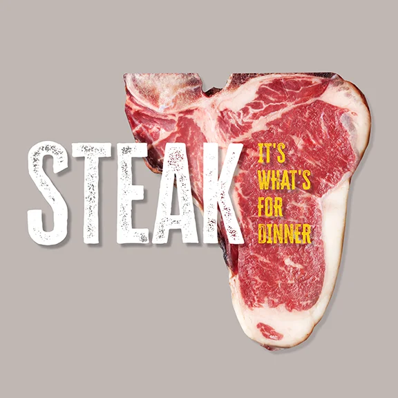
This is my original Photoshop file that I created using a stock image (licensed) image of a steak. I could have used this project as an excuse to have steak for dinner and grab a couple from the grocery store, but I took the easy way out. I may pick up some later.
By the way, I use Envato Elements for all of my stock images, music, animations, and fonts.
Also, I’m planning on using a Fruit of the Loom IC47MR t-shirt in Oatmeal Heather as the shirt blank. The hue behind the art is a representation of that shirt color.
We’ll call that Shirt Color from now on.
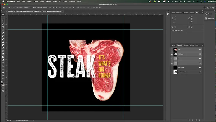
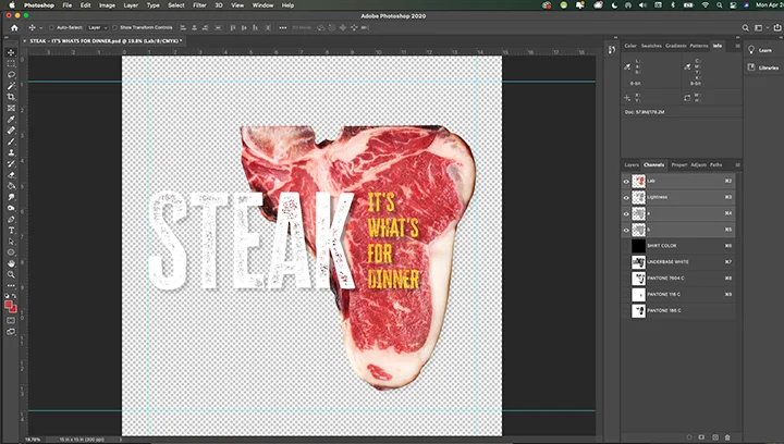
Step One: Convert from RGB to LAB
If you want to follow along, download the 37MB Photoshop art file now. Click here. All of the separation and demo files are there too.
I always start my simulated process separation work in LAB mode. The LAB color space is a little different than RGB or CMYK. However your original file is saved, convert it to LAB mode first.
LAB stands for Lightness Channel, A Channel, and B Channel.
The Lightness channel is basically the luminosity of the image. We’ll be using that to make the Underbase Screen. It’s perfect for our use. The A and B channels are all of the colors of the image. As this article isn’t a technical one written to explain the awesome power of LAB, we’ll just leave it at that.
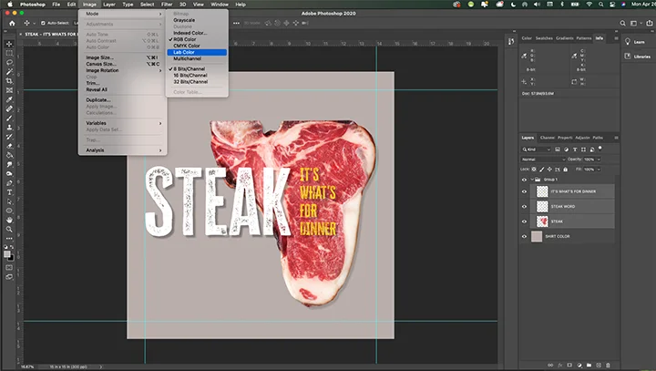
The Color Mode controls can be found at the top menu bar. Go to Images > Mode > Lab Color.
Just pull down until you make the selection and then release.
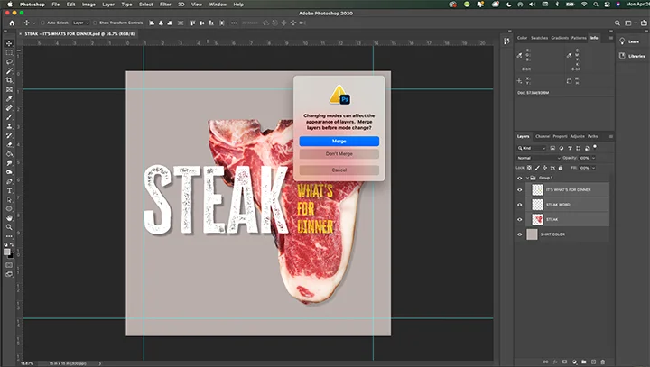
Photoshop will ask if you want to Merge the Layers. As we need everything on separate layers to work later, click Don’t Merge.
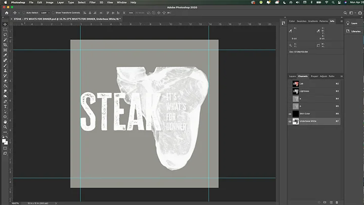
Step Two: Create the Underbase White
Next, we want to create an Underbase White plate. While the Oatmeal Heather shirt color is probably light enough to print without one, maybe we’ll print this on a darker shirt later on, so we’ll create one anyway.
Besides, it’s always good to practice!
For this step, we’ll need to make a duplicate of the Shirt Color Layer and make it Black.
At the bottom of the Layers Control Panel, you will find a square with a plus sign inside. That is the Create New Layer button.
Duplicate the Shirt Color Layer by grabbing the Shirt Color Layer and dragging it down to the Create New Layer button. You can also do this same maneuver by going to Layer > Duplicate Layer.
Then, find the original Shirt Color Layer. Click the icon that looks like a human eye, and the Layer will turn off. To turn it back on again, you would simply re-click it. But for now, leave it off.
For the duplicate Shirt Color Layer, use the Paint Bucket Tool and make the entire layer black.
Working in Channels
Next up, we will start working in Channels, which is a separate area and the controls are by the Layer controls. Click the Channels tab and you will see that there are four Channels listed.
- Lab, which is all of the channels when they are on and visible
- Lightness, which is the luminosity channel.
- a, which is red-green axis of color
- b, which is the blue-yellow axis of color
All are currently selected, as you are viewing all of the LAB channels when they are turned on.
If you click the Lightness channel, this will be the only one selected. Do so now.
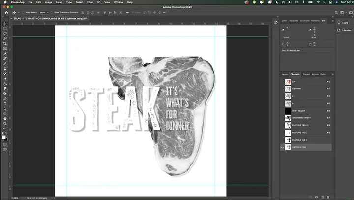
Duplicate the Lightness Channel
At the bottom of the Channel Control Panel, you will find a square with a plus sign inside. That is the Create New Channel button.
If you click and drag the Lightness Channel down and hover over that button and release, the Lightness Channel will be duplicated. You can also do this same maneuver by going to Image > Duplicate Channel.
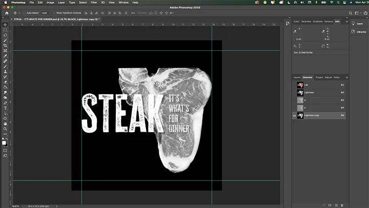
You’ll notice that this looks like a black and white photograph. This is exactly what we want.
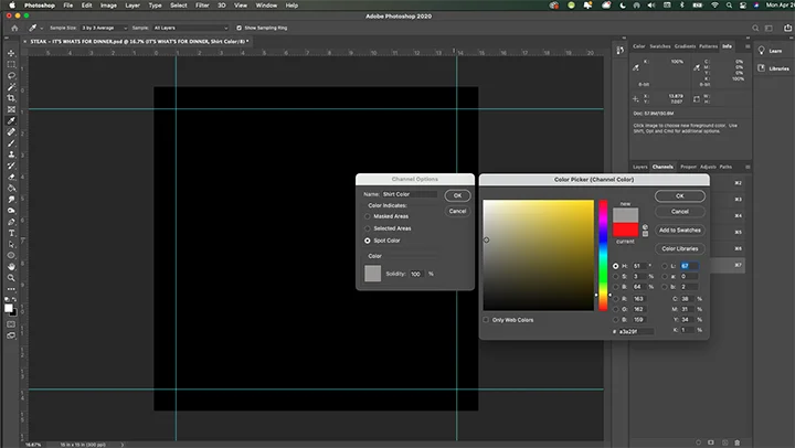
Make a Shirt Color Channel
Click the Create New Channel button at the bottom of the control panel. A new channel will appear, and it will be named Alpha 1.
Double click the name, and change that to Shirt Color. Then, next to the name is a small black square.
Double click that and the Channel Options menu will appear. Choose Spot Color. On that menu, there will be a red square. Double click that, and the Color Picker (Channel Color) menu will appear.
Dial-in and select a t-shirt hue that best matches the garment color for the project. Click ok when you are satisfied.
Rearrange the channel order so that the Lightness Channel is at the bottom, with the Shirt Color channel right above it.
Lightness Channel Work
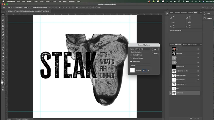
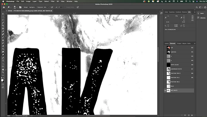
Next, double click on the new Lightness channel name. It will be noted as Lightness copy. Change that to Underbase White.
Next to the new Underbase White name is a thumbnail of the channel. Double click that so the Channel Options menu appears. We want to turn the channel color from red to white. It’s easy.
Double click the red square on the Channel Options menu.
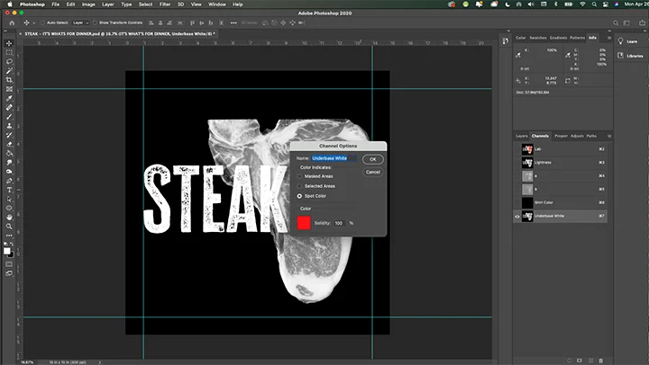
The Color Picker (Channel Color) menu will appear. Make the color white and click ok. On the Channel Options menu, make the selection Spot Color, and the Solidity 95%. Click ok.
Invert the Underbase White Channel
Next, we want to invert the image so that the black areas will be white, and the white areas will be black. Trust me, this will work. On a Mac, this is simply Command I. But, you can also go to Image > Adjustment > Invert.
Then, turn on the Shirt Color channel and view your simulated process work so far!
It should look like this:
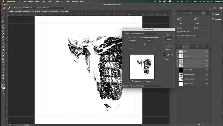
Step Three: Using the Color Range Tool
Now, we’re going to find the other colors in the design and pull them out of the photograph using the Color Range tool. This is a very handy tool that has a knack for grabbing color and letting you make a spot color channel with it.
Warning! It takes some time and practice to monkey around with it and get everything in the design that you want. I’ll walk you through how to use it, and then also what to do if you don’t quite get everything you need.
Getting Busy
Let’s start by setting up our work for this tool.
In Channels, grab the Lab channels and turn off the spot color channels we just made by clicking the Lab channel.
Then, we’ll head over to the Layers command. As we don’t want to worry about grabbing any of the background colors that will be the shirt, go ahead and turn off the black shirt color layer that we created earlier.
What’s left is only the art that we are going to pick from for the Color Range tool. Then, flip back to Channels where we will do our next work.
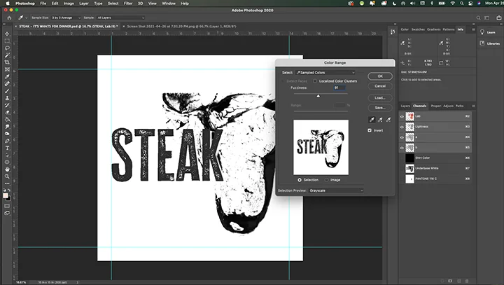
Use the Color Range Tool
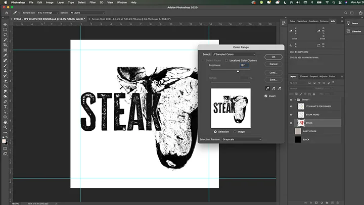
The Color Range Tool in Photoshop is a pulldown from the top. Go to Select > Color Range and pulldown so that the Color Range menu palette will appear.
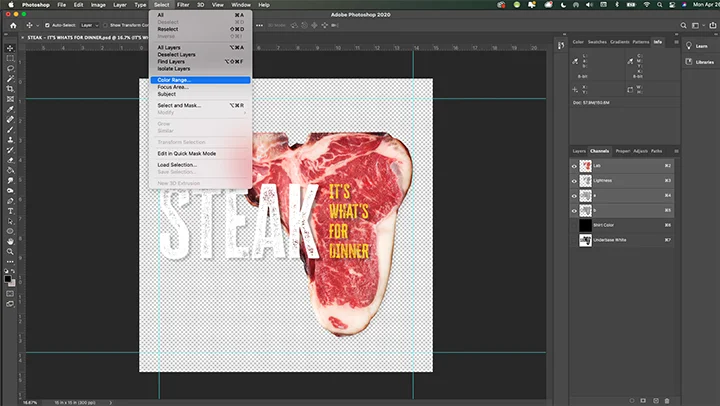
To make things easy, let’s grab the yellow gold color of the type that reads, “IT’S WHAT’S FOR DINNER.”
This works using the Eye Dropper Tool to locate and find specific color hues in the image. Practice clicking around and see what you can select.
Then, click on any of the yellow gold area of the type.
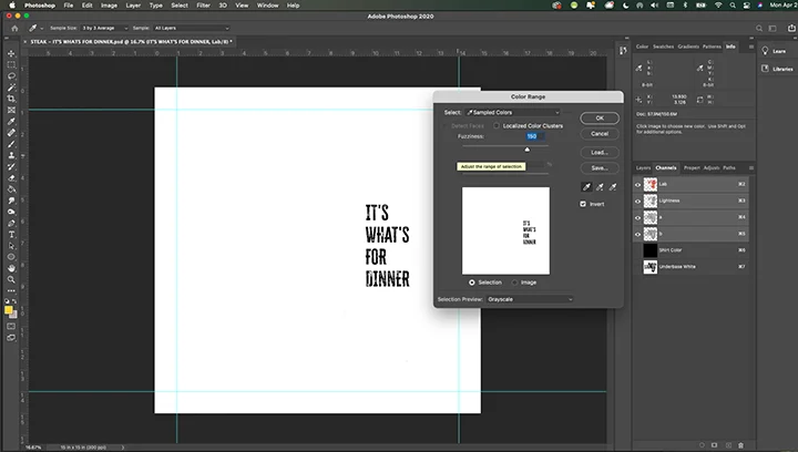
The Color Range Tool works best when you have these selected:
- Click “Invert” on the Color Range palette to have the small thumbnail box turn to white and only show your current selection in black.
- Use the Fuzziness Slider at the top to grab more or less of the color you want to grab.
- Then, at the bottom choose Selection Preview to have the entire image reflect what you are grabbing.
Before you click ok, practice sliding the Fuzziness Slider back and forth all the way in each direction so you can see how this works. For the yellow-gold color, there’s not much there. For the other colors of the steak, this is going to be a bigger challenge.
When you are satisfied that you have selected the hue you want correctly, click Ok.
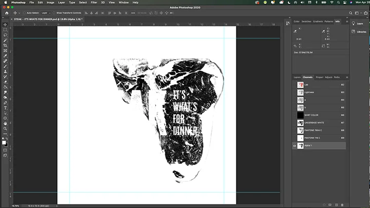
Make a New Channel
You’ll see what’s known as the “Marching Ants” selection around what you chose.
Now, simply go to the bottom of the Channel controls and click Create New Channel. A new channel will appear called Alpha 1.
Invert it like we did previously with either Command I or Image > Adjustments > Invert.
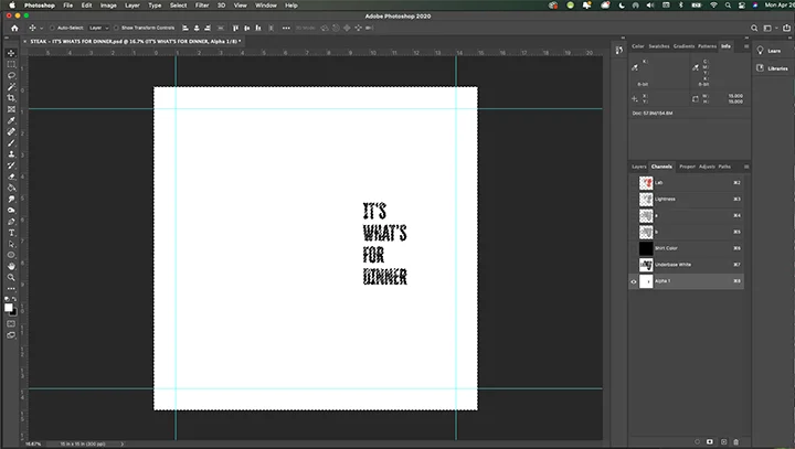
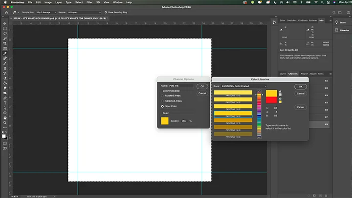
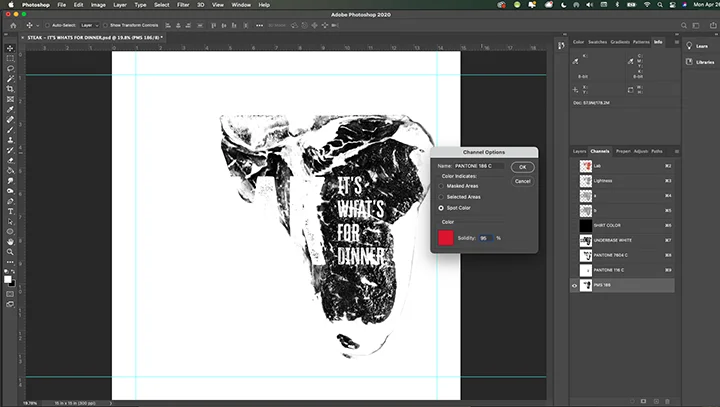
Bingo! You can Deselect the image now that you have created a new channel by clicking Command D. Now, let’s rename it and make the new channel the right spot color.
Double click the name Alpha 1, and change it to PMS 116. Then, double click the thumbnail next to the name and open up the Channel Options menu. Like you did previously, double-click the red square to bring up the Color Picker (Channel Color) menu palette. (Getting the hang of this aren’t you!)
Now, we want to make this a specific Pantone color, PMS 116. On the Color Picker menu, you’ll see a button that reads Color Libraries. Click that.
Type in 116, and Photoshop will automatically pick it for you. Click Ok. When you get back to the Channel Options palette, make the selection Spot color, and the Solidity 95%. Click Ok.
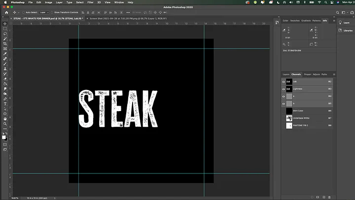
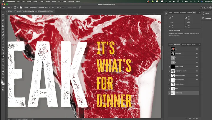
Turn All Channels On
Now, let’s see where we are so far. Turn on all three of your new Spot color channels.
Your image should look like this:
Step Four: Picking Another Color
Now that you have the basic understanding of how to use the Color Range Tool for simulated process separations, let’s grab the creamy pinkish fat color for the steak.
To do that, we’re going to basically repeat the same steps that we used for the PMS 116 spot color, but because the color is all around the steak and not isolated as type it is going to be a little trickier.
To begin, let’s get our image back to the starting stages for our work. Click on the Lab Channel and Photoshop will automatically deselect our new channels and go back to our original image that we can use for the selection.
Use the Color Range Tool Again
Click Select > Color Range and the Color Range menu palette will appear. To use this again, make sure that the Selection Preview pulldown at the bottom is set to None, otherwise, you can’t pick the new selection easily.
For our selection, the creamy color of the steak fat is a light color, and initially, when the Color Picker pops up, you may have the word STEAK selected in the range. We don’t want this, and that’s why we are going to use the Fuzziness Slider.
Underneath the Fuzziness Slider is a triangular handle that controls the amount of the color that you are selected with the Color Range Tool. In this example, the finder is set to 91, which is too powerful, as it is grabbing the White area of the word STEAK.
If we slide the control to the left we can find just the right amount to find the creamy color we want, and not grab the white text.
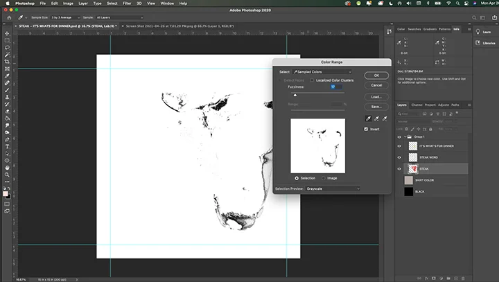
Except when we do that, not a lot of the creamy color gets selected by the Color Picker Tool.
Using the Apply Image Command to Modify Selections
Here’s where a very handy technique comes in to modify a selection to either add part of an image, remove part of an image, or even add a slight suggestion of an image to give some enhanced color to an area.
If you haven’t used Apply Image before, this is one of the most powerful tools in Photoshop. We’re going to use it now and use one channel to modify another for a desirable result.
Take A Step Back
So now, what we want to do is to create the perfect creamy fat color plate for the steak image and not worry about the actual word STEAK, as we are going to delete that using the Apply Image command.
By the way, yes there are other ways to do this, but the intent here is to teach how to use the Apply Image command.
Start by repeating the steps and select a good bit of the creamy fat color on the steak. As this is going to print early in the press sequence, we can get a lot of the color as the other color will print on top and mix on the shirt.
That’s the beauty of simulated process.
We’ll make a new channel like we did previously, and give it a nice creamy pink color, PMS 7604. But, we’re not finished with this plate yet.
Here’s the Reason You Don’t Flatten Layers
Now, to use the word STEAK easily, all we need to do is turn off all of the Layers, and leave on the Black Shirt Color Layer and the word STEAK layer.
Flip back to Channels.
Can you guess what’s coming?
That’s right, we’re going to drag the Lightness Channel down to the Create New Channel button and create a new channel for the word STEAK. We’ll use this channel to modify our PMS 7604 plate.
Invert the channel, and you’ll end up with this.
Now, Here’s the Fun Part
We’re going to use this new STEAK channel to modify the existing PMS 7604 plate and delete what we don’t want.
To do that, you are going to learn to use the Apply Image command. This is a very powerful tool, as you can use different images to modify an existing one, and to any degree you want.
For this instance, we want to completely delete the word STEAK from our PMS 7604 channel.
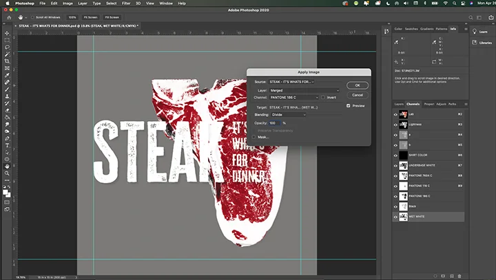
Use the Apply Image Command
Start by selecting the PMS 7604 channel. Then, go to Image > Apply Image and bring up the Apply Image menu palette.
- With the PMS 7604 plate still selected and the Apply Image command running, choose the Lightness Channel on the Apply Image menu palette under Channel.
- Under Blending, choose Divide as the command and the strength should be 100%. Click Ok.
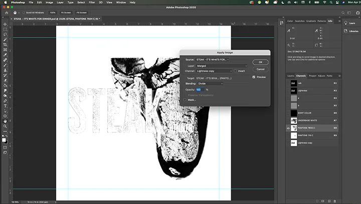
The word STEAK is removed from the PMS 7604 plate. Delete the Lightness copy with the word STEAK, as you don’t need it.
Click in and turn on all of our channels so your image looks like this:
Step Five: Adding Red Meat To Our Diet
Now is the time we need to repeat the Color Range steps and grab the red meat color from the image and make a new spot color plate.
Let’s get back to a start position by clicking the Lab channel, which automatically turns off the new spot color plates we have been creating and goes back to the original file. You may have to go back to Layers and turn off the background layer if it is still on.
I make that mistake all the time.

Pull Up the Color Range Tool
Now, pull up our old friend the Color Range Tool. Use it and grab a real red meaty part of the image.
Adjust the Fuzziness Slider until you are satisfied with the selection and click Ok. The “Marching Ants” that demonstrate what you have selected will appear.

Next, click on the Create New Channel button at the bottom of the channel control panel. A new channel will appear called Alpha 1. Click Command I to invert it or go to Image > Adjustment > Invert. Press Command D to deselect the Marching Ants.
Rename the file PMS 186, and let’s make channel use that color with the steps we have completed previously. Double click the name to change it. Then to the left of the name, double click the thumbnail image to bring up the Channel Options menu palette. Double click the red square, and then click Color Libraries to get into the Pantone area. Type in 186, and Photoshop will select that color automatically for you. Click Ok. Change the Opacity to 95%, and choose Spot Color and click Ok on the Channel Options menu palette.
Now, let’s see how it looks with all of the channels turned on.
Yep. Getting hungrier by the minute, I’ll bet.
Step Six: Black For Contrast
This step is going to be easy, as we can use the Lightness channel again to help build out our darker tones. A Black plate will help punch up the color and give more depth to the image.
Let’s get back to the starter position before we do anything. Go ahead and click on Lab at the top of the Channels Control panel to deselect all of the spot color plates that have been created, and get back to our original file.
For this step, the Lightness channel has all that we need. Simply click on the Lightness channel and drag it down to the Create New Channel button.
This plate is almost perfect, but it is just a tad too dark in the mid-tones. To adjust, use the Curves Tool to modify the plate and get it just right. Command M brings up the Curves Tool, or you can go to Image > Adjustments > Curves.
Note: while some Photoshop users like to use Levels for adjustments like this, I like the interface of Curves better. It is a personal preference.
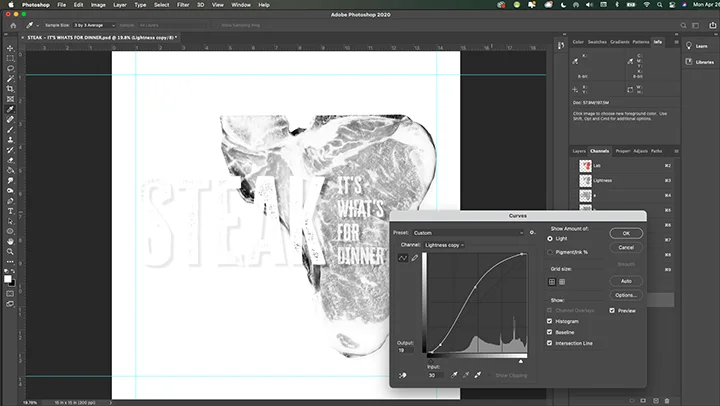
Compare the differences in the two plates. You can see that some areas are lighter in tone, while others are darker.
Let’s see how it looks now with all of the spot color plates turned on:
I don’t know about you, but I’m ready to fire up the grill. However, we still are not quite finished here.
Even though this is on a lighter colored shirt, we still should make a Wet White plate to give the simulated process separation added punch and the option to be able to print on any color shirt. We’ll show some shirt color variations at the end too.
Step Seven: The Wet White Plate
This is usually the final plate in the print sequence as a brilliant white plate punches up any t-shirt design. It’s printed last and will help gel all of the previous plates printed before it.
And good news, there’s nothing to it. To get started we’re going to modify the Lightness channel again, and then use some Apply Image magic and a Curve to make it work.
Start with the Lightness Channel
To get started, click over to Layers and turn on that Black shirt color layer so the background is black. Then, click back to the Channel Control area.
Build a new channel by clicking the Lightness channel and dragging it down to the Create New Channel button. A new channel will appear and it will be named Alpha 1. Invert it by clicking Command I or going to Images > Adjustments > Invert.
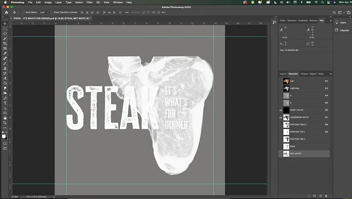
Rename this Wet White, and double click the thumbnail image and make the plate a white Spot color with the Channel Options menu palette just like you have done previously.
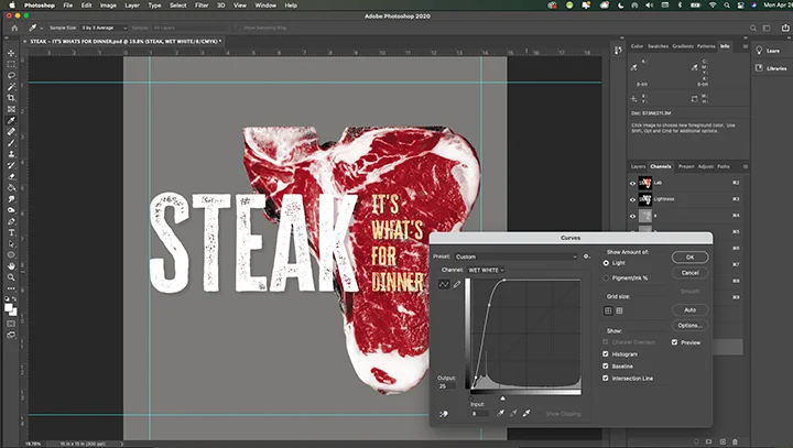
Wet White Midtone Adjustment
As you can see, the mid-tones where the red meat is for this image is too prominent and we need to scale it back. Remember, in the view, the darker the part of the image, the whiter it will be on the print.
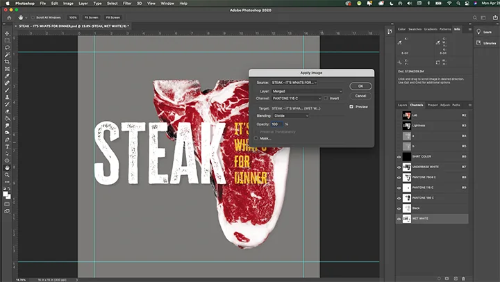
Using the Apply Image command again, we want to modify the Wet White plate by taking out the areas that are over the PMS 186 red plate. This is where a good bit of the mid-tone range is on the design and a good place to start.
Go to Image > Apply Image with the Wet White plate selected. Use the Divide command with the PMS 186 plate as the modifier.
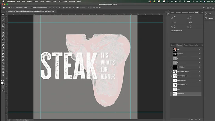
Now, using the Curves command back off on the rest of the midtones so that the marbled look of the steak shows through.
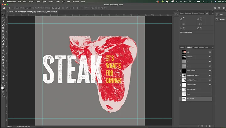
Also, there are some White ink that is over the PMS 116 letters, so we’ll use the Apply Image command to knock those out.
Step Eight: Review Your Work
Starting with the Shirt Color Channel on, I like to turn on each plate individually to see if there are any areas that need specific help.
Always work macro to micro. Never fuss about the details on your seps until 95% of the work is handled.


Micro Editing
When you take a critical eye to your different simulated process plates, you can sometimes make a creative call on what needs to change.
There are plenty of tools you can use, depending on the situation. Typically I only use two. Dodge and Burn.
The Dodge Tool lightens areas, and the Burn tool will darken them. Remember, you are lightening or darkening the halftones of areas you are correcting.
Here’s an example. As you can see above, the K in STEAK stands out a little better against the pink marbling than with the Wet White halftone there.
Going in and editing around these areas could make a difference in the legibility of the overall design, so it’s worth the time.
With a little tweaking the Wet White plate is corrected.
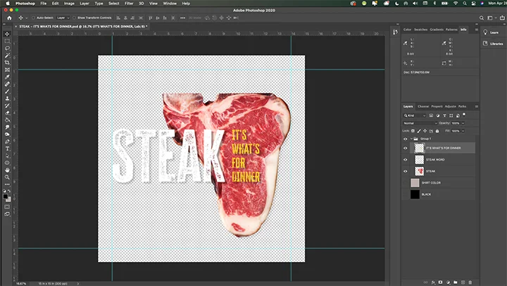
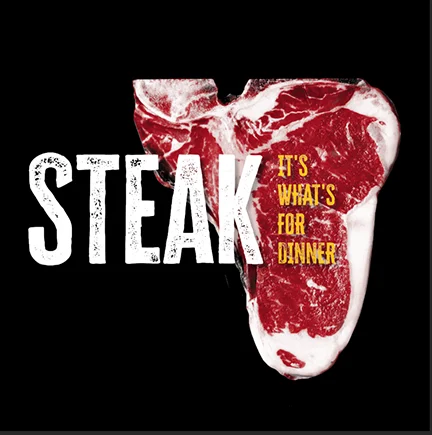
Each plate is adjusted and then here’s the final product, ready to separate:
Step Nine: Separate the File Into Individual Channels and Print
Just a reminder that this simulated process sep file is built 100% to size. It’s made as a full-size image for a t-shirt, so you can separate the file and it’s ready to go.
First, save the file and rename it with the word SEPS at the end. Having a different file for your separation file will help you if you need to go back and redo something with a plate later.
After you have resaved and renamed the file, use the new one with the word SEPS at the end of the name. Go to Layers and Flatten the entire file.
You need to do this before you can split the channels.
Then, find the hamburger menu bars at the top of the Channel Control panel in the upper right corner. Pull down until you see Split Channels and release.
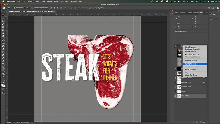
Each channel will split into its own separate file. I like to rename them, as Photoshop can give them a modified version of the name due to character limits. For each file, I save them as .tiff files that can be brought into another program and printed or used as-is.
For the LAB channels and the Shirt Color plate, you don’t have to save or use them as they served their purpose.
Conclusion: What Just Happened
If you are separating a simulated process file for the first time, know that this can take some practice to perfect.
The trick to doing this correctly and quickly is setting up your file as you are building it for separations. As you learned, using the Lightness channel is a great place to build up other plates and create what you need for the final product.
There was very little micro editing here. If you know your Photoshop keyboard commands, you can probably separate a file like this from start to finish in about ten or fifteen minutes with practice. No plug-ins or other software needed.
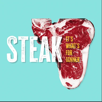
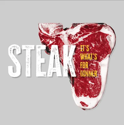
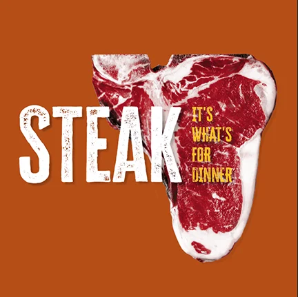
One Last Thing
Here’s one last thing. Demo proofing. You can show your customer or your sales team a few shirt color variations simply by changing the Shirt Color Channel color in the background and taking a screen capture of it and cropping the picture.
Here are a few for you to enjoy.
“Life is what happens to you when you are busy making other plans.” – John Lennon
“Sometimes life hits you in the head with a brick. Don’t lose faith.” – Steve Jobs
“There are three constants in life…change, choice, and principles.” – Stephen Covey
Want to Learn More?
Did you know that I have a book on using textures that you can take with your cell phone and incorporate them into your art?
It’s called T-shirt Texture Tricks, and it’s only $29.
Get one for your shop and learn to master using textures for your art today!


1 comment
kameleon1er
Hello I would like to thank you for France, for this course on the decomposition of the colors by way of the channels and the selection of the ranges of colors.
I still have some difficulties to understand the inversions after the selections, I thought that it was only useful when we wanted to print on dark or black T-Shirt.
I am more interested in printing on paper, but I understand that your method works for both.
A small remark, I downloaded your example files, and I was a little confused because on the “original art file” the work on the channels are already done 😉
But, many thanks for sharing.
Best regards.