Recently in the Shirt Lab Tribe live Q&A session on Zoom, the group discussion was focused on ways to run an Art Department better. As a former art director, I have some viewpoints on this and thought it would make a good topic for an article.
Buckle up kiddos. Here we go!
Let’s Start With The Obvious
Speed and quality in the art department can increase exponentially if your shop simply handles one thing correctly. Can you guess what that might be?
Brand new Mac Powerbook? Nope, but I like what you are thinking.
Crazy-talented designer and separation ninja? You need that certainly, but that’s not where I’m going with this.
A dimly-lit room with some funky music playing softly, and some incense burning?
Um. No.
Here’s the answer: It all starts with your sales and customer service team on getting the right information and directions from your customers. Your art department should shoot for (and track) an 85% first time art approval acceptance rate from your customers.
This means that for at least 85% of the time when they send something out, it comes back approved immediately from the customer without any changes.
Bingo!
Speed comes from getting the details right in the creative brief that originates from your customer-facing group. That’s your sales and customer service or order entry team.
This idea works whether you are using a group of creative artists in-house or outsourcing your art department.
Here’s A Problematic Example
Often when I’m coaching clients through this, I use an example project for a client to talk about what might be needed to do this particular workflow right.
Customer: “Here’s our idea for the t-shirt. We want a monkey riding a bicycle. The headline should read, ‘We’re Open!’ Our logo should be on there too somewhere.”
Salesperson: “No problem. Our design team will get right on it. They will design something really cool.”
Does this exchange sound like a typical conversation for your shop?
The salesperson didn’t ask any questions at all to nail down a direction for the creative. They will simply hand off this time-sucking hand grenade to the art team to wrestle with.
This design is destined to be changed or edited at least three times. Maybe more.
Especially when the salesperson says to the art team the three most hated words they could ever say; “Do something cool.” (If that’s you, please stop doing that.)
Why can’t production get started with staging and organizing jobs on time? Frankly, because a huge chunk of the jobs on your schedule aren’t even approved yet.
You need to get a handle on this.
What Works – Asking Better Questions
Instead, your customer-facing team needs to be trained to ask better questions to nail down a direction for your creative staff to execute. Think of these questions as guideposts or breadcrumbs along the way for your art crew to follow.
Let’s revisit that same example conversation.
Customer: “Here’s our idea for the t-shirt. We want a monkey riding a bicycle. The headline should read, ‘We’re Open!’ Our logo should be on there too somewhere.”
Salesperson: “A monkey riding a bicycle! That’s interesting. What kind of monkey, and what type of bicycle?”
Customer: “What do you mean?”
Salesperson: “We want to nail the art the first time out, so these details matter. Is the monkey a chimpanzee, a spider monkey, a gorilla…what type of monkey are you imagining?”
Customer: “Oh, I see. We were thinking about a big gorilla riding a tiny bicycle.”
Salesperson: “That’s hilarious! How do you envision the art? Is it an illustration, a cartoon line-drawing, something realistic? Do you have anything similar you can show me?”
Customer: “I don’t have anything to show you, but I do want it to be cartoony…but with a realistic feel. I guess you could call that an illustration.”
Salesperson: “Ok, that’s good to know. What should the gorilla be wearing?”
Customer: “What do you mean?”
Salesperson: “Is the gorilla naked on the tiny bicycle? Also, what type of bicycle do you have in mind for that?”
Customer: “Gotcha. I guess the gorilla should be wearing clothes. Let’s have the gorilla be wearing one of our t-shirts that you print for us. That green staff t-shirt. With some yellow shorts. And maybe a baseball hat. Can you use the one you embroider for us? For the bike, it doesn’t matter the type, but it should be funny. That’s what we’re going for here.
Salesperson: “What if the bike was a tricycle? That’s funnier than a bike.”
Customer: “Yes! That’s perfect.”
Salesperson: “Good. Let’s talk about the copy “We’re Open!” and your logo. Where do you see those on the design?”
Customer: “I was thinking that “We’re Open!” should be in an arch across the top. The gorilla on the tricycle is underneath. Our logo is on the bottom underneath that. What do you think?”
Salesperson: (Sketches a thumbnail doodle) “You mean like this?”
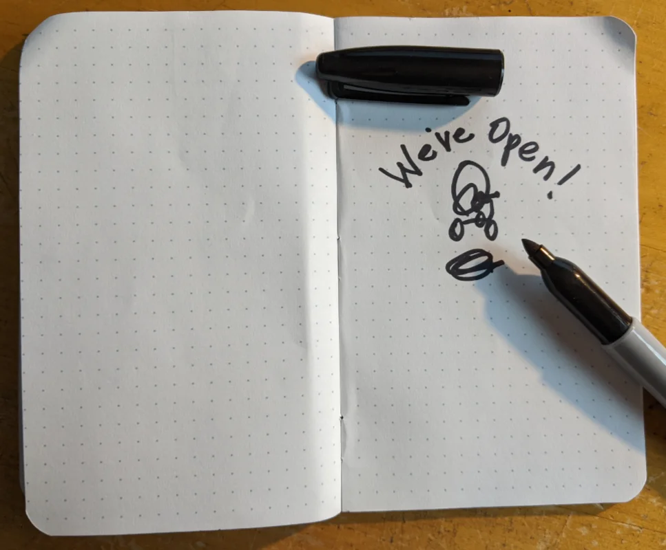
Customer: “Ooooh. I don’t like that. “We’re Open!” is going to look weird in an arch. What about if the phrase was underneath the gorilla?”
Salesperson: (Sketches another doodle underneath). “Here you go.”

Customer: “That’s it! Can we make the logo bigger?”
Salesperson: “Of course. Now we have something to go on. I have one last question. What don’t you want to see in this illustration? We want to avoid that.”
Customer: “The gorilla should look happy. Not frowning or angry.
Salesperson: “Ok, to sum up, here’s what we should design. A happy gorilla wearing your branded green staff shirt, embroidered cap, with yellow shorts, riding a tiny tricycle. ‘We’re Open!’ is underneath the illustration, with your logo, underneath that fairly large, about 4″ in width. Do I have that correct?”
Customer: “Perfect. I can’t wait to see this.”
What’s The Difference Here?
Imagine you are an artist that is assigned to produce this work for your customer. Which scenario would you rather start with?
- Do something cool. Design a gorilla riding a bicycle with “We’re Here!” and use the company logo.
- Design an illustration with a happy gorilla wearing the company’s green staff shirt and cap, with yellow shorts. The gorilla is riding a tricycle. The illustration should be realistic, but cartoony-funny. “We’re Open!” is big and bold and underneath the illustration. The company logo is centered underneath the text, and is 4″ wide.
As the customer was already involved in the creation of the thumbnail sketch, they are more apt to approve the layout if the sketch is followed by the artist.
The artist can have free reign in creating something awesome because the salesperson and the customer have given them enough details to easily pinpoint a direction to follow.
That “Do something cool” instruction would have completely missed the mark and lead to several rounds of changes. Don’t forget, each time you have to go back to the proverbial drawing board that costs your shop time, energy, and money.
Was the salesperson a professional artist? Of course not. If you can scribble and write somewhat legibly, that’s all we need in a thumbnail. The key elements are in there.
- Where is the main part of the illustration? What’s the story?
- Where should the copy or text go?
- Where should the company logo go?
Everything else the skill and creative pizazz that you hired your art staff for can be figured out. Also, if you don’t have someone on your team that is capable of creating this type of illustration, your salesperson should state that and that you will need to bring in someone that can do the job. There are plenty of fantastic freelance artists in this industry, plus some design services that can handle it. They are going to want good instructions too.
So the secret tip on getting things through the art department faster isn’t going to be some sort of pixel wizardry with your creative team, but rather better instructions and detail from your sales or customer service reps.
Clarity in communication works wonders. Is it time to rethink how your situation works?
“To design is to communicate clearly by whatever means you can control or master.” – Milton Glaser
“Design is everything. Everything!” – Paul Rand
“Good design is good business.” – Ian Schrager
Elevate T-shirt Design
All around you are textures that you can use by taking a photograph with the camera in your cell phone. Use those images and manipulate them to elevate your creativity in Photoshop for t-shirt designs.
This fun book walks you through the process step-by-step.
The final chapters explain how to do simulated process separations with easy to learn steps.
Hundreds of texture files and all of the Photoshop files and lessons are available for download for free.
Want to know how to create those detailed and fully textured designs? This eBook explains the basic steps in creating those files and separating them for t-shirt screen-printing.
It’s $29, and can immediately help make an impact on your t-shirt designs!

